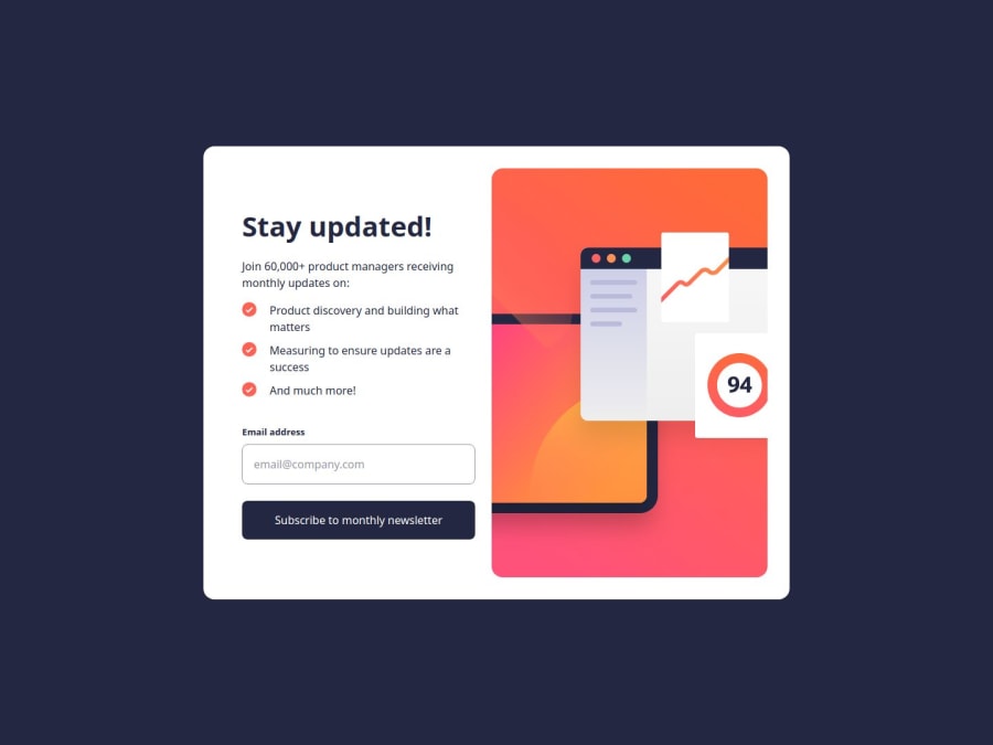
Mobile-first solution using CSS Grid and Flexbox


Design comparison

Solution retrospective
What I am most proud of in this project is that I finally mastered using both Grid and Flexbox to create a layout. Prior to this, I had never used Grid and Flexbox for layout design. Achieving this is truly an exciting milestone for me.
What challenges did you encounter, and how did you overcome them?One of the challenges I encountered was positioning the modal (newsletter/success) in the center of the layout using Grid. Initially, I struggled to center the modal. However, I discovered that using align-content: center;, justify-content: center;, and justify-items: center; solved the problem and perfectly centered the modal.
What specific areas of your project would you like help with?If possible, please review my CSS. I am a complete beginner when it comes to CSS; previously, I was only taught to use it in a way that worked for desktop layouts without considering responsiveness. Please teach me the best practices in CSS if there are areas that need improvement.
Community feedback
Please log in to post a comment
Log in with GitHub
Join our Discord community
Join thousands of Frontend Mentor community members taking the challenges, sharing resources, helping each other, and chatting about all things front-end!
Join our Discord