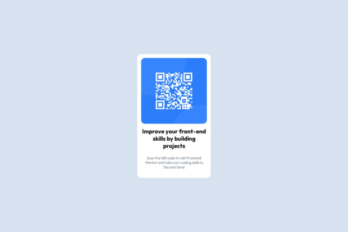
Design comparison
Solution retrospective
I am proud that i was able to finish the challenge with no major problem
What challenges did you encounter, and how did you overcome them?The challenge that i encounter was to center verticaly the qr code component and to overcome it i just have to specify a height to all my body
What specific areas of your project would you like help with?i would like help space between my element in my qr code component
Community feedback
- @StroudyPosted 2 months ago
Amazing job with this! You’re making fantastic progress. Here are some small tweaks that might take your solution to the next level…
-
Using a
<main>
tag inside the<body>
of your HTML is a best practice because it clearly identifies the main content of your page. This helps with accessibility and improves how search engines understand your content. -
Having a clear and descriptive
alt
text for images is important because it helps people who use screen readers understand the content, making your site more accessible. It also improves SEO, as search engines usealt
text to understand the image's context, helping your site rank better, Check this out Write helpful Alt Text to describe images, -
For future project, You could download and host your own fonts using
@font-face
improves website performance by reducing external requests, provides more control over font usage, ensures consistency across browsers, enhances offline availability, and avoids potential issues if third-party font services become unavailable. Place to get .woff2 fonts -
While
px
is useful for precise, fixed sizing, such asborder-width
,border-radius
,inline-padding
, and<img>
sizes, it has limitations. Pixels don't scale well with user settings or adapt to different devices, which can negatively impact accessibility and responsiveness. For example, usingpx
for font sizes can make text harder to read on some screens, Check this article why font-size must NEVER be in pixels. In contrast, relative units likerem
and adjust based on the user’s preferences and device settings, making your design more flexible and accessible. Usepx
where exact sizing is needed, but prefer relative units for scalable layouts. If you want a deeper explanation watch this video by Kevin Powell CSS em and rem explained. Another great resource I found useful is this px to rem converter based on the default font-size of 16 pixel. -
This does not matter that much at this stage but something to be mindful of for SEO(Search Engine Optimisation),
<meta>
description tag missing that helps search engine determine what the page is about, Something like this<meta name="description" content="description goes here" />
You’re doing fantastic! I hope these tips help you as you continue your coding journey. Stay curious and keep experimenting—every challenge is an opportunity to learn. Have fun, and keep coding with confidence! 🌟
0 -
- @MikDra1Posted 2 months ago
If you want to make your card responsive with ease you can use this technique:
.card { width: 90%; max-width: 37.5rem; }
On the smaller screens card will be 90% of the parent (here body), but as soon as the card will be 37.5rem (600px) it will lock with this size.
Also to put the card in the center I advise you to use this code snippet:
.container { display: grid; place-items: center; }
Hope you found this comment helpful 💗💗💗
Good job and keep going 😁😊😉
0 - @mohbscodePosted 2 months ago
Good use of the <section> header.
the layout looks good and the code is well structured
0
Please log in to post a comment
Log in with GitHubJoin our Discord community
Join thousands of Frontend Mentor community members taking the challenges, sharing resources, helping each other, and chatting about all things front-end!
Join our Discord