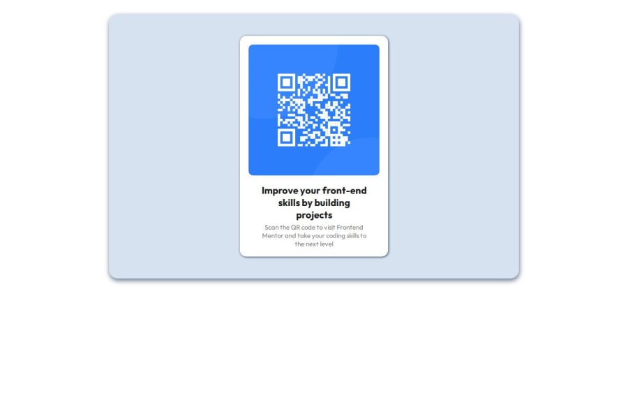


Design comparison

Solution retrospective
I learned about using the CSS flex property and media query. When I used the CSS flex property alongside fixed width, my project wasn't centered, but as soon as I removed the fixed width, my project became centered. Also, my mobile version was wonky even though my codes were right. I realised the problem was the order. I had placed the mobile media query before the tablet media query. The solution was to put the mobile media query before the tablet media query.
What specific areas of your project would you like help with?I currently need help in understanding the relationship between css flex property and fixed width.
Community feedback
- @manish2120Posted 6 months ago
I'm not good in semantics or styling, but here are some points I’ve noticed hope its correct :) :
Regarding HTML:
- You should use semantic tags like <main> and <footer> here to properly define your main content and content information.
- In your boilerplate code, it's better to place the `stylesheets before the closing
</head>tag.
Regarding CSS:
- Consider using min-height on the body or your container elements to ensure the minimum height of the parent element or body to covers the background and i guess it will help you here to center your content.
- Make sure to closely follow the Figma design. This will help you create an output that closely matches the design provided.
Overall, nice work! By the way, it's nice to see that you used an
<h1>tag and applied styling to it separately. I recently got to know about it that we should use heading tags according to their levels for semantic purpose.Marked as helpful0@joyafrikaanaPosted 6 months agoThanks, I recently understood the importance of semantic tags and I'd ensure I incorporate it henceforth. Also, thanks for the comment on min-height, it was quite helpful. @manish2120
0@joyafrikaanaPosted 6 months agoThanks, I recently understood the importance of semantic tags and I'd ensure I incorporate it henceforth. Also, thanks for the comment on min-height, it was quite helpful. @manish2120
0

Please log in to post a comment
Log in with GitHub
Join our Discord community
Join thousands of Frontend Mentor community members taking the challenges, sharing resources, helping each other, and chatting about all things front-end!
Join our Discord