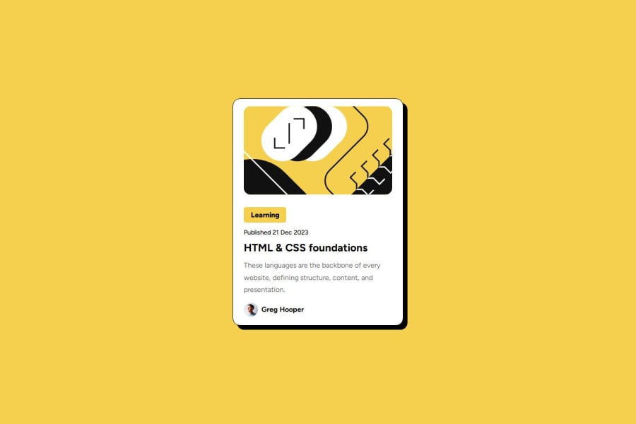
Mobile-first solution of a blog using CSS Flexbox and Box Shadow
Design comparison
Solution retrospective
i am proud that i was able to complete the challenge
What challenges did you encounter, and how did you overcome them?The challenges that i encounter was correctly to adjust the image in the div
What specific areas of your project would you like help with?To adjust the image in the div
Community feedback
- @AdrianoEscarabotePosted 6 months ago
Hi djklive, how’s everything? I think your project turned out great! However, I have some feedback that I think might be useful:
We have to make sure that all the content is contained in a reference region, designated with HTML5 reference elements.
native HTML5 reference elements:
<body>
    <header>This is the header</header>
    <nav>This is the nav</nav>
    <main>This is the main</main>
    <footer>This is the footer</footer>
</body>
The rest is amazing.
I hope this is helpful. 👍
0 - @Ttyn08Posted 6 months ago
Does the solution include semantic HTML Is it accessible and can improve the arrangement of tags Is the layout beautiful on multiple screen sizes Is the code well-structured, readable and reusable
0
Please log in to post a comment
Log in with GitHubJoin our Discord community
Join thousands of Frontend Mentor community members taking the challenges, sharing resources, helping each other, and chatting about all things front-end!
Join our Discord
