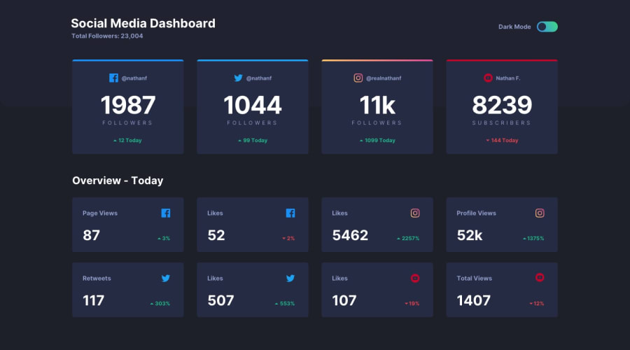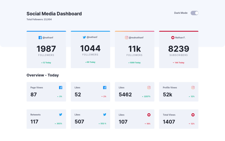
Design comparison
Solution retrospective
Had a little problem with theme switching solution so i had to search how to implement it. I used SCSS for this and reassign variables to make it switchable on click. Used GRID and FLEXBOX in this challenge. Made it keyboard accessible and responsive. Hope it all works well, happy to hear some feedback :)
Community feedback
- @grace-snowPosted over 3 years ago
Hey, this looks really nice, you've done a great job.
The only things I find a bit odd are
- how the dark mode toggle is announced by my screenreader. Because you're used a button rather than a checkbox or radios, there is no actual announcement of the change. I can toggle the button on and off no problem but all that gets announced every time is "press switch-button Dark Mode, button"
- adding tabindex to the cards as if they are meant to be interactive. I keep trying to select them, click them, and nothing happens. That makes it seem like something is broken, like something is meant to happen? Was that the intention there?
- having the numbers like 1987 as heading elements. That doesn't make sense on my headings list (how you navigate and see a content overview on screenreaders). Those numbers only make sense when read out with their accompanying word. I would argue the social media type is the heading, the rest like username, number of followers and whether that has gone up or down are all content under that social media type. It might be worth adding some hidden headings/spans even to make it clearer what the content means. e.g. Top section gets a h2 of "summary" and box__headers get an sr-only span of "username: "
Other than that, all looks great. The transitions are really smooth and it looks good at all screen sizes
Marked as helpful2@FesoQuePosted over 3 years ago@grace-snow I read your reply and and I would like to ask a question on the third point you raised on using heading element (h2) for the number of followers
Did you mean the social media (@username) get the heading elements and content underneaths (the followers count etc can be the <p>/<span> elements )? Awaiting your response, thanks.
0@Vj3koPosted over 3 years ago@grace-snow tnx for your feedback.
1- i added button instead of checkbox cuz i had issues on previous challenge when i couldn't access checkbox with SPACE but everyone else could. I could access on other browsers but not on chrome, it worked perfectly on firefox and the rest browsers and incognito chrome mode. It was only today that problem was solved with removing an extension called Evernote clipper so i used button cuz wanted to see the change and to be keyboard accessible.
2- adding tabindex i only added that cuz i wanted to tab over those cards, but no intention there, just to make it tabable ( if it's a word). But it seems like its a stupid idea so i won't do it anymore :D
Also thank u once again for taking some time to give a valuable feedback , always appreciated from u.
0 - @ApplePieGiraffePosted over 3 years ago
Hello there, Vjekoslav! 👋
Nice job on this challenge! 👍 Your solution looks good, responds very well, and the light/dark themes work great! 🙌
All I can suggest is perhaps to take a look at the points outlined by grace-snow in her helpful feedback for your solution. 😉
Keep coding (and happy coding, too)! 😁
0@Vj3koPosted over 3 years ago@ApplePieGiraffe tnx for feedback :) happy coding as usual :D
0
Please log in to post a comment
Log in with GitHubJoin our Discord community
Join thousands of Frontend Mentor community members taking the challenges, sharing resources, helping each other, and chatting about all things front-end!
Join our Discord