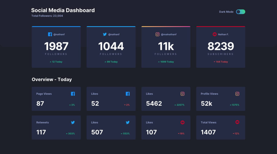
Design comparison
Solution retrospective
First non-newbie project, definitely felt an increase in difficulty with this one. Trying to figure out how to switch themes took quite a while. I think I got it though, although the code did get a bit confusing along the way. As usual, and tips on general code quality or anything that could be improved are highly appreciated :)
Community feedback
- @mattstuddertPosted over 4 years ago
Great work on this challenge, Gediminas! You've done a really good job. How did you find it working on a non-newbie project? Did you learn anything new while completing it?
Here are a couple of small pointers on adjustments I'd recommend for the HTML:
- You're writing uppercase "FOLLOWERS", etc in your HTML. I'd recommend not doing this, as some screen reader software will read this out letter-by-letter, therefore, making the content inaccessible to screen reader users. Instead, I'd write it normally in the HTML and then use
text-transform: uppercase;in your CSS to visually alter it. - You're using a paragraph tags for your
. social__titleand.subtitle-textelements, whereas I'd say these are headings. Personally I'd use ah2for the. social__titleandh3for the.subtitle-textto provide a proper content hierarchy. This is another crucial element in creating accessible web pages.
I hope this helps. Keep up the great work! 👍
1@SenatriusPosted over 4 years ago@mattstuddert It definitely felt more challenging. Things like data-* attributes haven't even crossed my mind before. Same with the toggle using CSS, things like using a hidden checkbox to create visual effects was one of those things I wasn't fully aware of. While in this case it was just a toggle, I'm sure I'll remember some of these techniques in other situations as well. So I'd say I learned quite a lot just from this one challenge :)
As for the uppercase HTML, I wasn't aware that capital text would mess with the screen readers, I'll be sure to keep that in mind.
Thanks for the advice!
0@mattstuddertPosted over 4 years ago@Senatrius you're welcome! Sorry for my delayed response to this. That's awesome to hear you learned a lot while going through this challenge!
1 - You're writing uppercase "FOLLOWERS", etc in your HTML. I'd recommend not doing this, as some screen reader software will read this out letter-by-letter, therefore, making the content inaccessible to screen reader users. Instead, I'd write it normally in the HTML and then use
Please log in to post a comment
Log in with GitHubJoin our Discord community
Join thousands of Frontend Mentor community members taking the challenges, sharing resources, helping each other, and chatting about all things front-end!
Join our Discord
