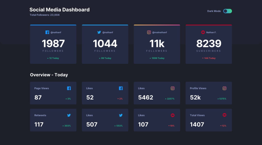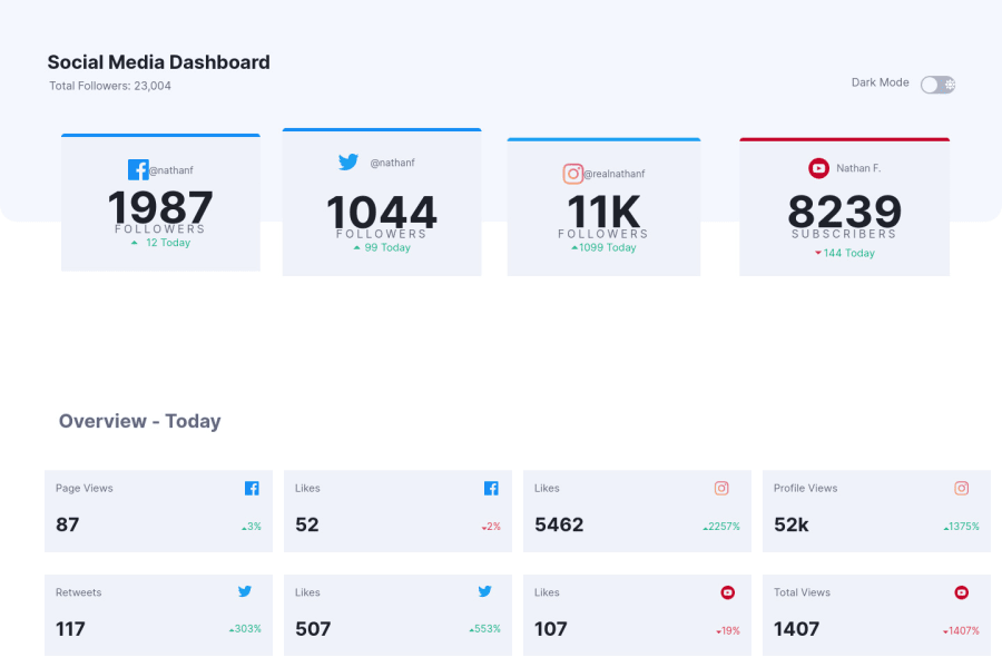
Mobile first social dashboard theme switcher using grid and flex
Design comparison
Solution retrospective
I had to test my knowledge of CSS grid. i had lots of issues building this site so any feedback will be appreciated on how to make my CSS coding syntax more professional and efficient as I'm able to move on to JavaScript in my studies. i've fixed the isue with accesibilty and have adding animation to the site. this site is responsive and accessible. it should work without any issue. If there is any issue with the browser support or the animation please leave a feedback. Any other feedback is really appreciated. I'll also apperiate if i can find any material or video tutorial on GSAP.
Community feedback
- @vishalbrdrPosted over 3 years ago
Try adding this code for your card containers display: grid; grid-template-columns: repeat(auto-fill, minmax(25rem, 1fr)); and for ACCESSIBILITY ISSUES wrap all your divs and section inside <main></main> Great job, have a look at my Solution:- https://vishalbrdr.github.io/Social-media-dashboard/
Marked as helpful0@victoriaodemakinPosted over 3 years ago@vishalbrdr thank you so much. i went through your code on GitHub. it really helped as I forgot I could use the :before pseudo-element. I have a question if I set the grid-template-column to repeat(auto-fill, minmax(25rem, 1fr)); how do i define the number of column I want. I don't have much experience with grid but doesn't this code(repeat(auto-fill, minmax(25rem, 1fr));) only caters for just two column? any response will be helpful. thank you again.
0@victoriaodemakinPosted over 3 years ago@vishalbrdr your animation was really nice too. what is GSAP ANIMATION please ?
0@vishalbrdrPosted over 3 years ago@victoriaodemakin this code grid-template-columns: repeat(auto-fill, minmax(25rem, 1fr)); automatically defines no. of columns required according to width of parent and child.
0@vishalbrdrPosted over 3 years ago@victoriaodemakin GSAP is a javascript library for animations.
0 - @palgrammingPosted over 3 years ago
On your top row of cards your twitter card is a different size than the other 3
Marked as helpful0 - @Blazing-MikePosted over 3 years ago
Nice one... You should check the margin side on Mobile screen... I'm currently doing this challenge too and it's hard to me... But I'm figuring out.
0
Please log in to post a comment
Log in with GitHubJoin our Discord community
Join thousands of Frontend Mentor community members taking the challenges, sharing resources, helping each other, and chatting about all things front-end!
Join our Discord