Submitted about 4 years ago
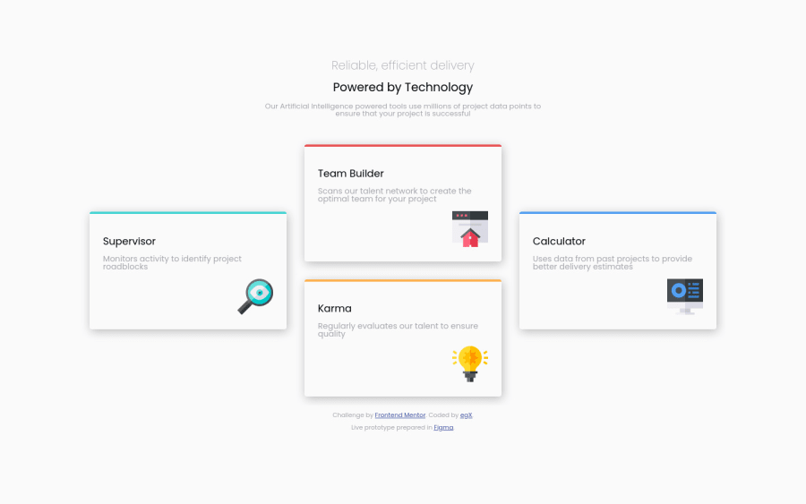
Mobile first sketched in Figma, used HTML and CSS (Flexbox and Grid)
@egxperience
Design comparison
SolutionDesign
Solution retrospective
Will be more than glad to hear opinions regarding this project. Comparing with template project didn't managed to 'convert' header part to more bold/wide view but still seems good for me, "media" query to change the grid starting from 640px wide Basic prototype prepared in Figma (https://www.figma.com/file/C0hC17jUwmA718PuqotJjj/four-card-feature-section?node-id=0%3A1) - still learning how to use it.
Community feedback
Please log in to post a comment
Log in with GitHubJoin our Discord community
Join thousands of Frontend Mentor community members taking the challenges, sharing resources, helping each other, and chatting about all things front-end!
Join our Discord
