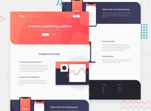
mobile first site with bem and scss and javascript nav
Design comparison
Solution retrospective
Thanks for anyfeedback, If you have any recomendantions on how to abstract the nav javascript more, would be good for advice. And do you recommend to use different classes for javascript than css or just use the same, when selecting them.
Thanks for your time.
Community feedback
- @jmnyaregaPosted over 3 years ago
Hi @heritio, nice work on the challenge I have few suggestions.
- If you are using BEM, you can not nest elements.
- Prefer using relative units[ ems, rems] to pixels em-vs-rem-vs-px
- It is advised not to use solid widths & heights, use
max-widthinstead. - Feel free to use multiple media queries to adjust background images on different screen sizes.
- Use
max-widthon text content to avoid text overstretching on big screen sizes. - Spacing between sections doesn't look proportional, You may want to use the same value.
- You can use
align-items: center, to place text content & images side by side.
Otherwise, this was an impressive effort. Happy coding!
Marked as helpful1@heritioPosted over 3 years ago@jmnyarega Thanks, i just reread article of bem, and you are right about the nesting, il improve on that thanks, I gues i cant escape rem and em, il start utilizing that to. I keep forgeting to use max width, il remember that. do you mean {align-items: center} used in display:flex context? rly helpfull feedback, thx
0@jmnyaregaPosted over 3 years agoyes, @heritio
   display: flex;
  align-items: center; // this will center content vertically
1
Please log in to post a comment
Log in with GitHubJoin our Discord community
Join thousands of Frontend Mentor community members taking the challenges, sharing resources, helping each other, and chatting about all things front-end!
Join our Discord
