Submitted almost 5 years ago
Mobile first site using Sass, Flexbox, BEM and JS
@sonickonic
Design comparison
SolutionDesign
Community feedback
- @sauravchamoli17Posted almost 5 years ago
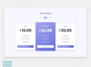
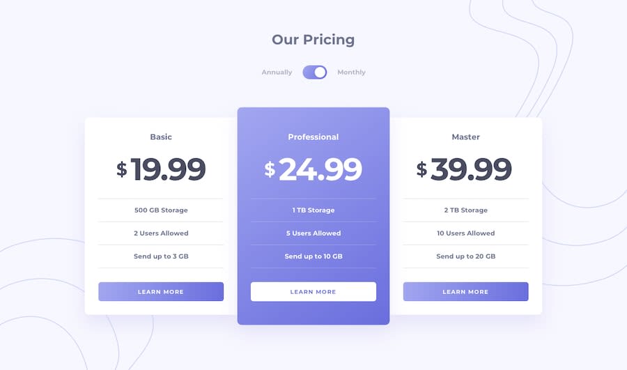
Awesome work! First time I've ever seen the screenshot of the solution is overlapping with the design. You just need to add hover state to the learn more button and then your solution is perfection.
1@sonickonicPosted almost 5 years ago@sauravchamoli17 Thank you! I used an :active selector, so when you click on the button the style will change. Do you think a :hover selector will suite this solution better?
0
Please log in to post a comment
Log in with GitHubJoin our Discord community
Join thousands of Frontend Mentor community members taking the challenges, sharing resources, helping each other, and chatting about all things front-end!
Join our Discord
