Mobile first site using Sass and a bit of JavaScript
Design comparison
Solution retrospective
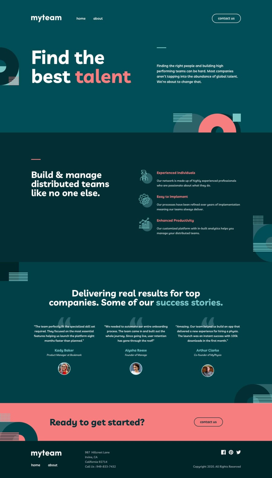
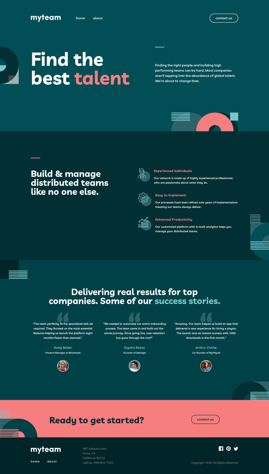
Hello people! :) I followed Matt's suggestion and coded mobile-first, what seems to be a bit more toilsome, but rewarding as well. For now, I know I have to work on consistency of BEM naming, there's form validation that needs improvement (I added an issue on GitHub repository).
All suggestions are very, very welcome! :)
Community feedback
- @adarshcodesPosted over 4 years ago
Hey @magdakok, Your solution looks astounding. It works so great, as @mattstuddert told you about the card's transition effect, it really looks nice. Great work!
2 - @HYannickPosted over 4 years ago
This is simply awesome! :D
Some suggestion on the menu animation, it's usually better to use css
transform
as they are smoother and more performant than absolute positioning :).I found a little issue when you activate the menu on mobile and then expand your screen, the menu disappear but the overlay is still here.
Also, it could be great to hide the menu when you click on the overlay :).
On the JS side maybe you could toggle classes instead of apply style in plain javascript. something like
nav__box--open
andnav__box--closed
, in order to make this more readable and BEM compliant.I love the flip animation on the about cards! This is really smooth and sick.
2@magdakokPosted over 4 years ago@HYannick Hello! Thank you very much, everything you mentioned is very helpful. I must admit I was a bit lazy with toggling classes, even though I knew it's a good practice. I'll fix it now :)
I'm not sure if I understood the first advice :) At the moment menu-box when hidden is positioned "right: -68%". Should I just change it to transform: translateX(-68%)?
I'm very happy with my flipping cards as well, especially how smoothly the button changes :D
Thank you for your feedback, it helps me a lot not making the same mistakes in new projects :) Have a good day and good luck with coding!
1@HYannickPosted over 4 years ago@magdakok eheh I understand, it happens for me sometimes, but it's always good to keep style in js only for tricky animations that need some calculations :).
And yes for the translation. and it's even better if you know the width of your menu container, you can apply it to the translateX :)
here is a more detailed explanation about why transforms are better for animations:
https://www.html5rocks.com/en/tutorials/speed/high-performance-animations/
1@magdakokPosted over 4 years ago@HYannick you're totally right :) Already fixed everything but the transform thing :). Thanks for the article! :)
0 - @mattstuddertPosted over 4 years ago
Awesome work, Magda! I hope you enjoyed the challenge. Working mobile-first is definitely tricky to start with, but it often actually speeds up workflow in the long run.
Your solution looks great! I especially like the card flip transitions on the about page. Keep up the great work! 🙌
1@magdakokPosted over 4 years ago@mattstuddert I enjoyed the challenge a lot! Having the sketch file made me feel like a real pro and helped me to get familiar with Adobe XD. It was so good I treated this project as a reward after studying a few units of JavaScript course every day :)
Thank you! :))
1@mattstuddertPosted over 4 years ago@magdakok awesome, that's exactly what I'm aiming for with the premium challenges so it's great to hear that. They do give a real glimpse into what the process would be like as a professional developer. Plus it adds an awesome project to your portfolio! 🥳
1 - @SahasSauravPosted over 4 years ago
hey i just curious how you added loading animatiom?
0@magdakokPosted over 4 years ago@SahasSaurav Hello, content animates just a bit when loading cause I add a transition to all elements :)
0
Please log in to post a comment
Log in with GitHubJoin our Discord community
Join thousands of Frontend Mentor community members taking the challenges, sharing resources, helping each other, and chatting about all things front-end!
Join our Discord