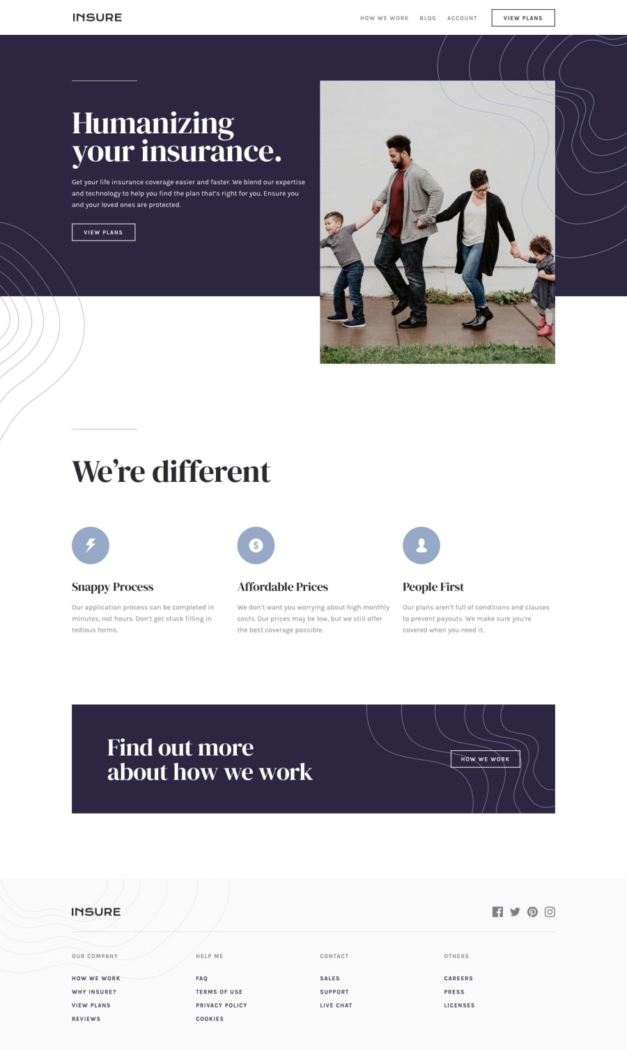
Design comparison
SolutionDesign
Solution retrospective
It's my very first Saas project so I will greatly appreciate it if you kindly give me some feedback.
Thanks :)
Community feedback
- @ApplePieGiraffePosted almost 4 years ago
Hey, good work on this challenge, aayushi simzia! 👋
Your solution looks nice! Kudos for using Sass (which makes styling with CSS a whole lot easier, I think)! 👏
I just suggest adding a hover state to the mobile menu navigation icon and the social media icons in the footer of the page.
Oh, and don't forget to identify each
<section>tag you use with a heading to clear up your solution report! 😉Keep coding (and happy coding, too)! 😁
0
Please log in to post a comment
Log in with GitHubJoin our Discord community
Join thousands of Frontend Mentor community members taking the challenges, sharing resources, helping each other, and chatting about all things front-end!
Join our Discord
