


@artimys
Posted
Nice job Karin on completing your first challenge. 👍 I have a few thoughts that I hope can help.
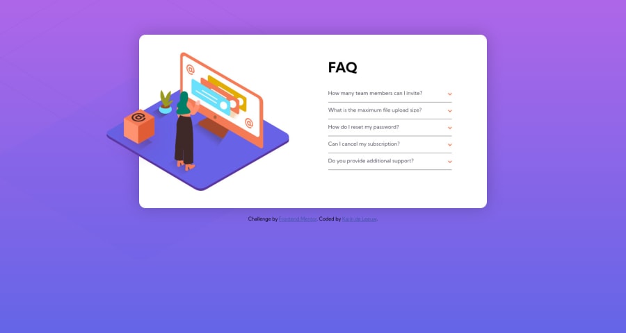
User Interface suggestions:
- To avoid the container from getting too tall in height I would look at changing the behavior of the toggling answers. Only allow one to be viewable. A common technique I see is using radio buttons
- Add some left/right spacing when your design first switches to desktop.
- Add a
cursor: pointerto your question/arrow hover styles
Code tips:
- One nifty method to center your entire container is using flexbox on the
body
body {
   display: flex;
   flex-direction: column;
   align-items: center;
   justify-content: center;
   min-height: 100vh;
}
-
The layering of the 3 desktop images can be tricky. I suggest for the little box to be in it's own
divcontainer using absolute positioning. For the other images you can try setting them both as multiple background images more info here -
Be sure to check out your solution report
Keep it up and happy coding 👍👍
Marked as helpful

I'll throw a spanner in the works and disagree with one of @artimys points above (other advice sounds great tho!) . You've made the accordions work exactly as they should and used an accessible pattern. It's an established ui pattern that collapsing sections (accordions) should allow for multiple to be open at once, otherwise it would be vertically stacked tabs and assistive tech would expect tab behaviour.
To fix your html validation issues you can put the button elements inside the faq question paragraphs rather than the other way around. I'd probably make them headings actually - they are headings for the answer content underneath so that would make sense. If you styled these headings in css, you can easily pass those styles down to the button with inherit: all.
I've only looked on mobile, but this looks good to me, well done 👍
Marked as helpful
@artimys
Posted
@grace-snow Accordion Debate!! j/k. To clarify my comment in case it's thought that all accordions should only have one panel open at a time. An accordion can go either way of one visible panel at a time or allow multiple open. Either pattern is fair game.
I believe a designer/developer will choose which one best fits their design/UX while always considering assistive technology. Regardless of which pattern used, content is already hidden so aria attributes, tabbing behavior should be utilized appropriately.
In regards to the current challenge. My thoughts viewing it on desktop with any panel open brings an undesirable white space to the box container height. But to your point it works well on mobile also.
Marked as helpful
