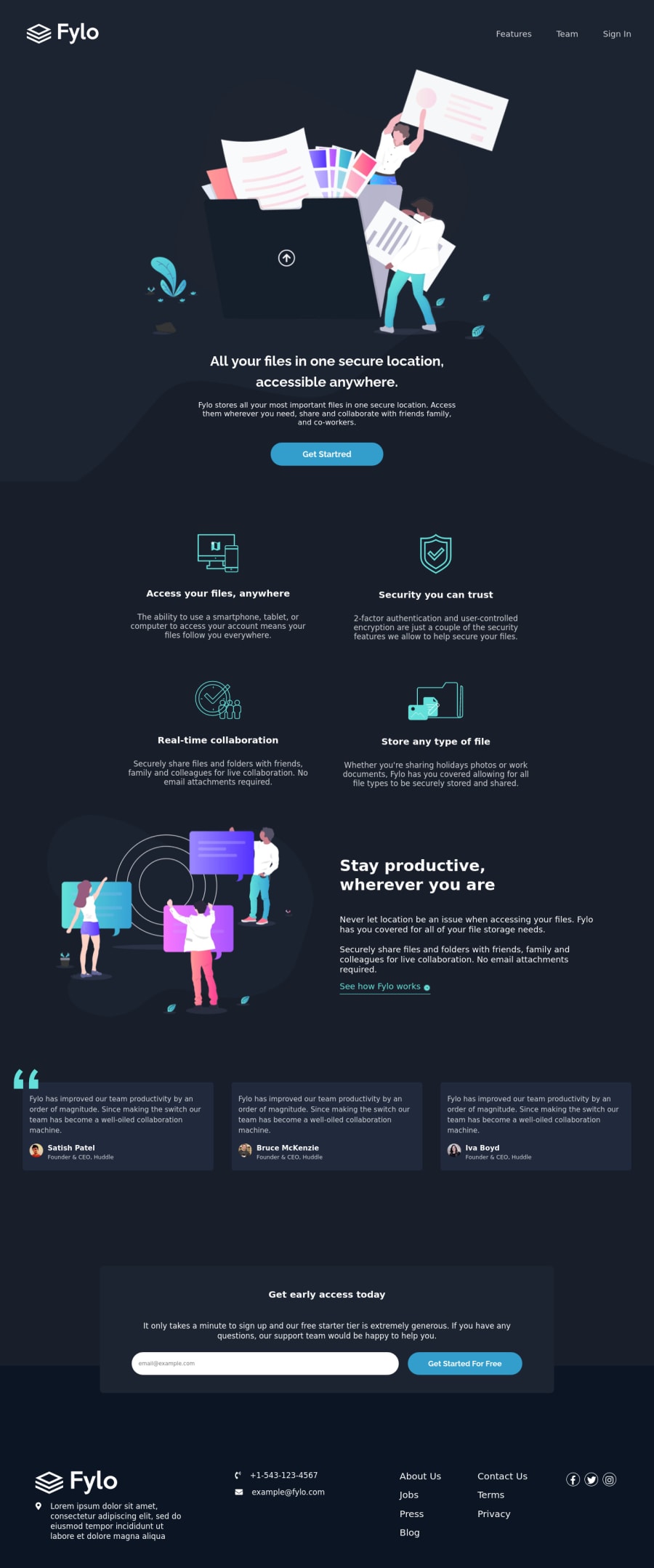
Design comparison
SolutionDesign
Solution retrospective
I could not use the curvy backgrounds properly...If you have any suggestions please mention them.
Community feedback
- @ChamuMutezvaPosted about 3 years ago
Greetings. Some issues have been raised in the report , some of them may include the following:
- alt values must be descriptive for the benefit of assistive tech users to be able to visualize the message that is being put across with the message. Decorative images can have
alt="". The following does not aid assistive tech users<img src="./images/illustration-intro.png" alt="illustration-intro" width="100%" id="img1"> - you site is missing basic elements like headings. Check on mdn on the importance headings
- as a follow up to the above point - use semantic elements where possible. Elements such as
mainshould be available in a site as they hold the main content of the site. - this image
<img src="./images/bg-quotes.png">does not have an alt value. If it is decorative usealt="" - input elements should have an associated label
<input type="email" name="mail" class="mailinput" placeholder="[email protected]"> - separation of concern is also important, let your css reside in their own css files
<div style="padding: 10px;"></div> - well done on responsive side, i can generally view the site on most devices from small to desktop.
Marked as helpful1@mnazneen20Posted about 3 years ago@ChamuMutezva thank you for your feedback, I will keep your points in mind.
0 - alt values must be descriptive for the benefit of assistive tech users to be able to visualize the message that is being put across with the message. Decorative images can have
Please log in to post a comment
Log in with GitHubJoin our Discord community
Join thousands of Frontend Mentor community members taking the challenges, sharing resources, helping each other, and chatting about all things front-end!
Join our Discord
