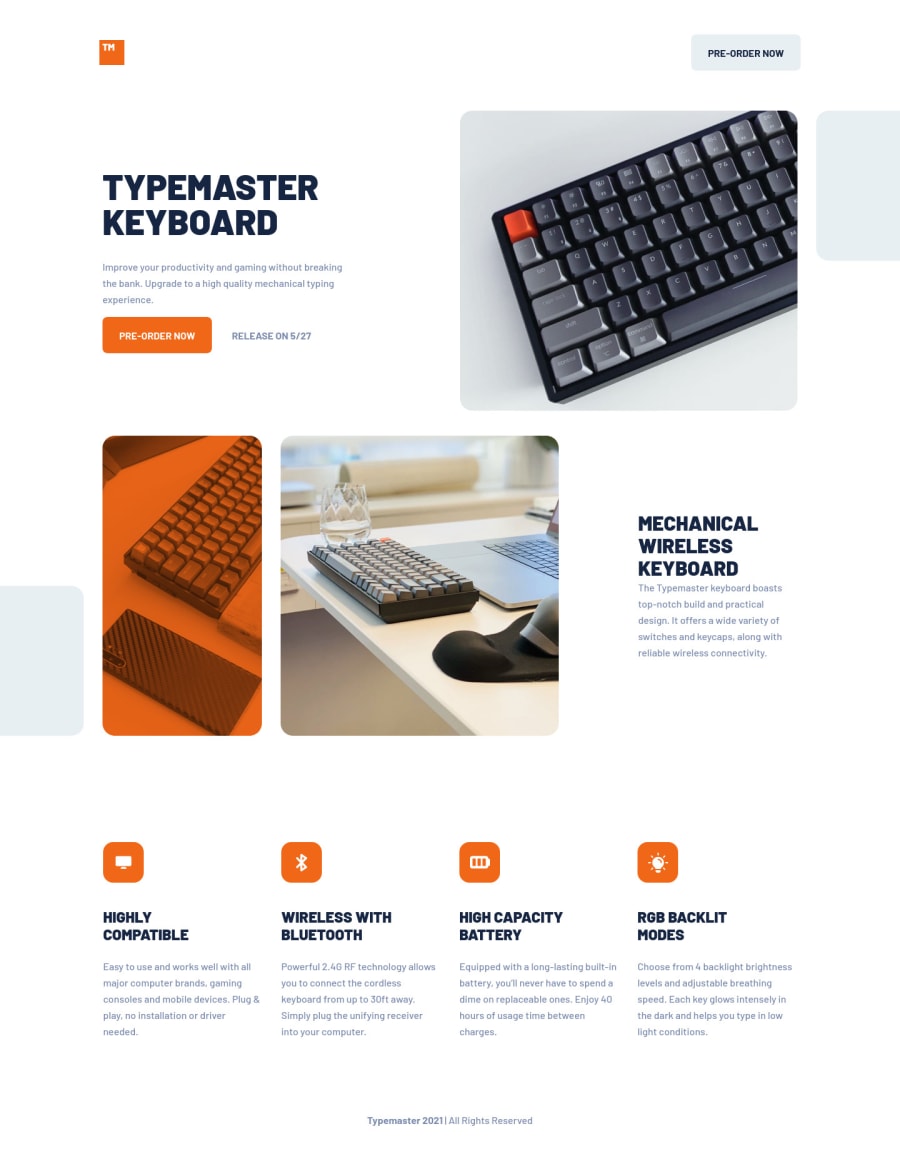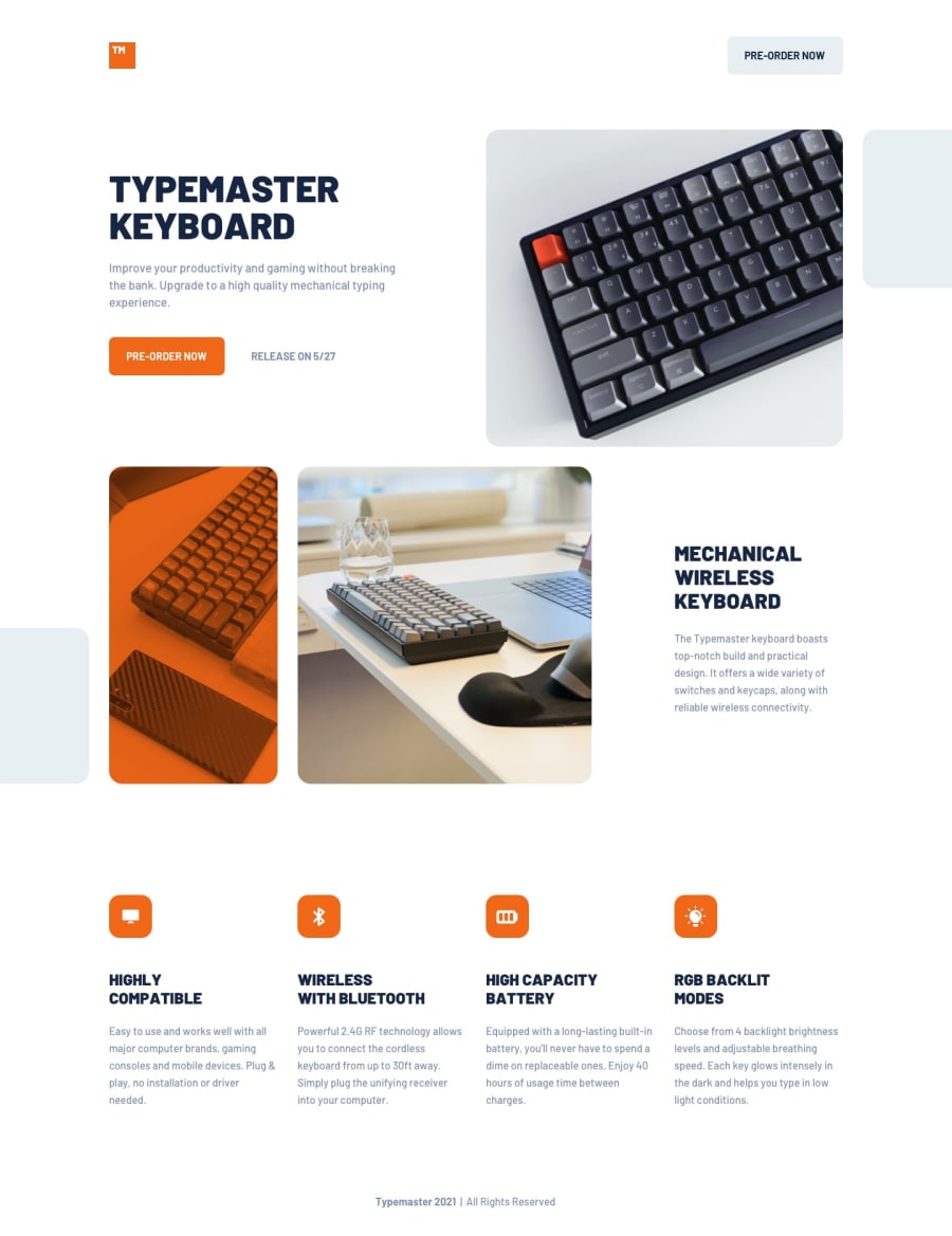
Design comparison
Solution retrospective
I'm wondering if I organized my files in a proper way, is this something that could be seen in a real-life project?
I would like you to judge the name I used for my classes and the semantic HTML.
I would appreciate any opinion about ways of improving. c:
Community feedback
- @palgrammingPosted over 3 years ago
The orange overlay image is not in the right positioning at the 375px mobile screen widths. Also the top logo and gray button go too wide in the desktop view
1@hec-lopzPosted over 3 years agoHello @palgramming,
Thank you for your feedback. Can you tell me what browser you are using, please?
0@palgrammingPosted over 3 years ago@hec-lopz in Firefox at about 391-389px the orange overlay and the other keyboard go from Row to Column. If that what you are wanting to do then fine
1@hec-lopzPosted over 3 years ago@palgramming. Hi again!
I've fixed the issues you mentioned, could you check out if you still see them?
0 - @ApplePieGiraffePosted over 3 years ago
Hello there, Hector Lopez! 👋
Well done on this challenge! 👍 Your solution looks great and scales up/down very nicely! 🙌 I think your HTML and CSS classnames look pretty good, too! 👏
Keep coding (and happy coding, too)! 😁
1@hec-lopzPosted over 3 years ago@ApplePieGiraffe Thank you very much! Same to you. c:
0
Please log in to post a comment
Log in with GitHubJoin our Discord community
Join thousands of Frontend Mentor community members taking the challenges, sharing resources, helping each other, and chatting about all things front-end!
Join our Discord
