Design comparison
Solution retrospective
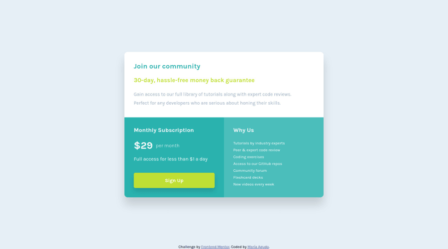
Hi! I need feedback about my responsive design. I used Mobile First for the first time and also rem units. I think I learned the MOST in this challenge. I thought: Hmm, this looks simple, let's LEARN about Mobile First design with this one. Then, I realized the issues when I zoom in my pages, and that lead me to investigate about rem units and actually apply them to all my design. I also think that I don't know what I'm doing or if I did it right :(
Community feedback
- @palgrammingPosted over 3 years ago
well when you first transition at your break point from mobile to desk then part of your design is out of the view-port. you might want to look at your break-point. I think the goal should be trying to keep the design consistent across screen widths not that the design needs to be constantly changing. If you are going to use media queries then you might as well you fix widths that can be controlled and updated
1@mdagudoPosted over 3 years ago@palgramming Thanks :) I'm new to media queries so I just did a design for 375px and 1440px width, how can I improve that?
0@momeniHINPosted over 3 years ago@mdagudo I think the easiest way is to start from mobile view and scale up to desktop view.
1@palgrammingPosted over 3 years ago@mdagudo this might help I hope https://www.freecodecamp.org/news/how-to-start-thinking-responsively/
0
Please log in to post a comment
Log in with GitHubJoin our Discord community
Join thousands of Frontend Mentor community members taking the challenges, sharing resources, helping each other, and chatting about all things front-end!
Join our Discord
