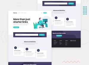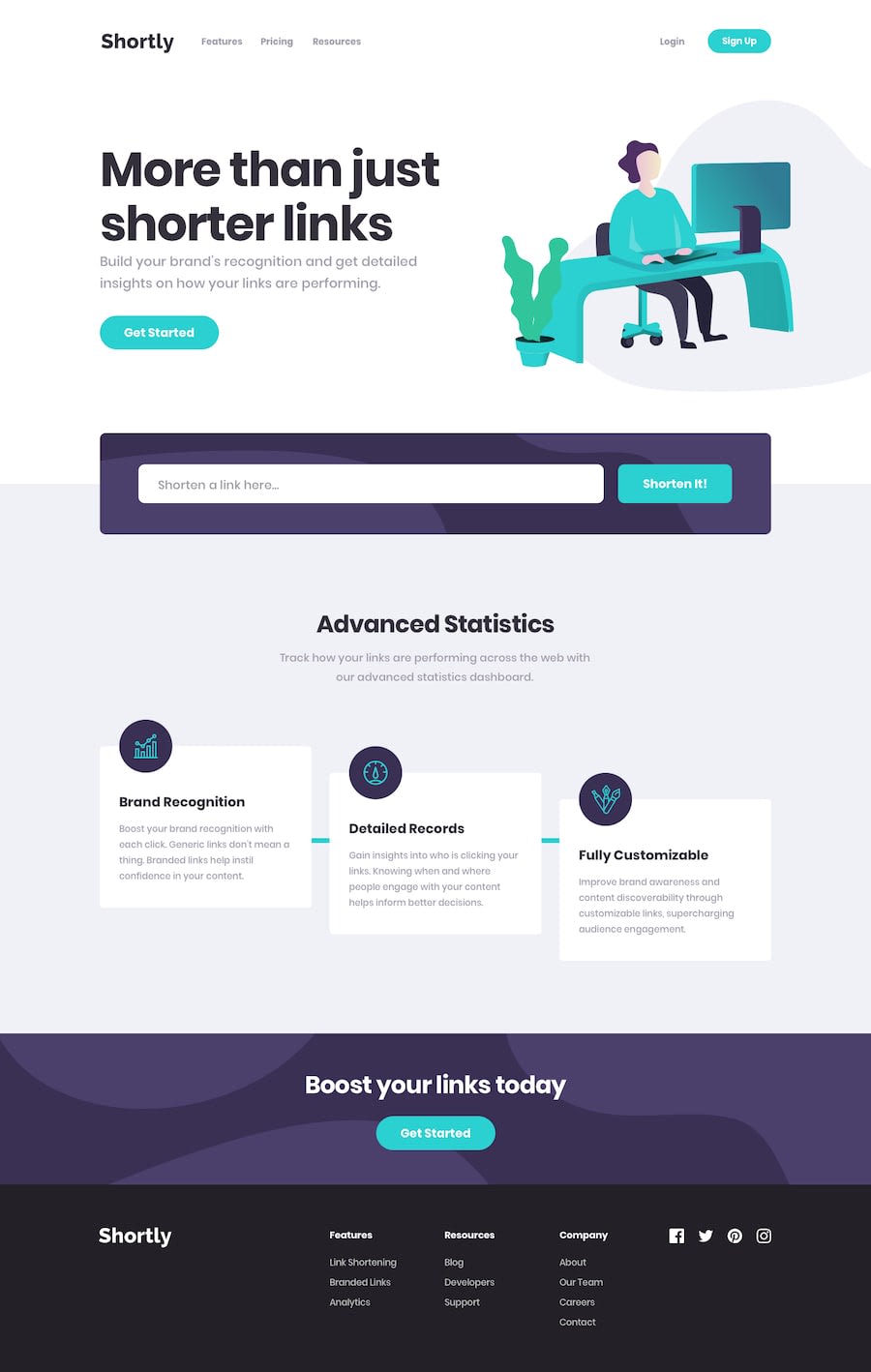
Mobile first shortly landing page built with React and SCSS
Design comparison
Solution retrospective
Please be as harsh as you can with any feedback :)
Community feedback
- @edrickalemaPosted about 3 years ago
I don't want to be harsh because it has been well built just awesome work. You are on track and keep on building
0@edrickalemaPosted almost 3 years ago@nkhatri7 great but I would love to know from you how you work on the background images to be displayed exactly like the way it was on the design
0@nkhatri7Posted almost 3 years ago@19alema You can integrate the image in the background in CSS. So it would look something like this:
background: purple url('path/to/image/') [no-repeat] [position];. The no-repeat and position are optional based on how you want the background to look. Sometimes Frontend Mentor designs the images so that you don't really have to add any positioning but sometimes you might have to alter it and write something liketop rightor in pixels or rem. This website is a good starting point for seeing how it all works.0
Please log in to post a comment
Log in with GitHubJoin our Discord community
Join thousands of Frontend Mentor community members taking the challenges, sharing resources, helping each other, and chatting about all things front-end!
Join our Discord
