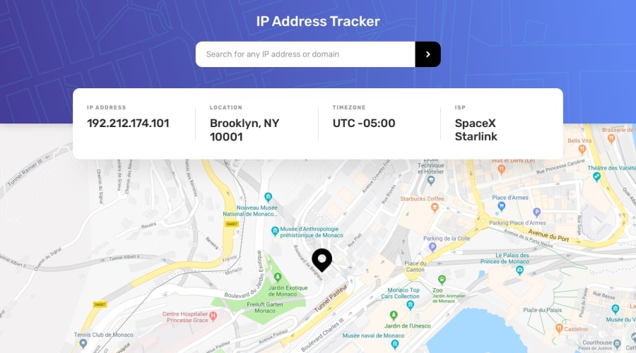
Design comparison
SolutionDesign
Solution retrospective
Feedbacks, suggestions, etc are appreciated...😊😊😊
Community feedback
- @adarshcodesPosted almost 4 years ago
Hi @Aditya6101, I believe you are doing great👍. You did nice work on this challenge. Let talk about your solution:
- Design aspect: You designed it similarly, but few things you can improve to make it much better, 1). it seems you forget to remove the attribution from the top and add it to the footer. 2). The IP address and the location are showing differences in the screenshot, if it's your IP update the screenshot(as it's not safe to give your IP publicly).
- Responsive aspect: Responsiveness is working fine.
- Issues aroused: Try to solve the Accessibility issues above. Keep it up👏. Happy coding😀
2@Aditya6101Posted almost 4 years ago@adarshcodes Thank for your feedback 👍👍👍... But i didn't get your point 2... will you plz explain it..
0@adarshcodesPosted almost 4 years ago@Aditya6101 I was saying if you compare the screenshot then you will find the IP address is different from the design.
0@Aditya6101Posted almost 4 years ago@adarshcodes ohh..i think that is auto generated or something like that... that's not my details....
0@adarshcodesPosted almost 4 years ago@Aditya6101 it's fine then. Have a great time.
0
Please log in to post a comment
Log in with GitHubJoin our Discord community
Join thousands of Frontend Mentor community members taking the challenges, sharing resources, helping each other, and chatting about all things front-end!
Join our Discord

