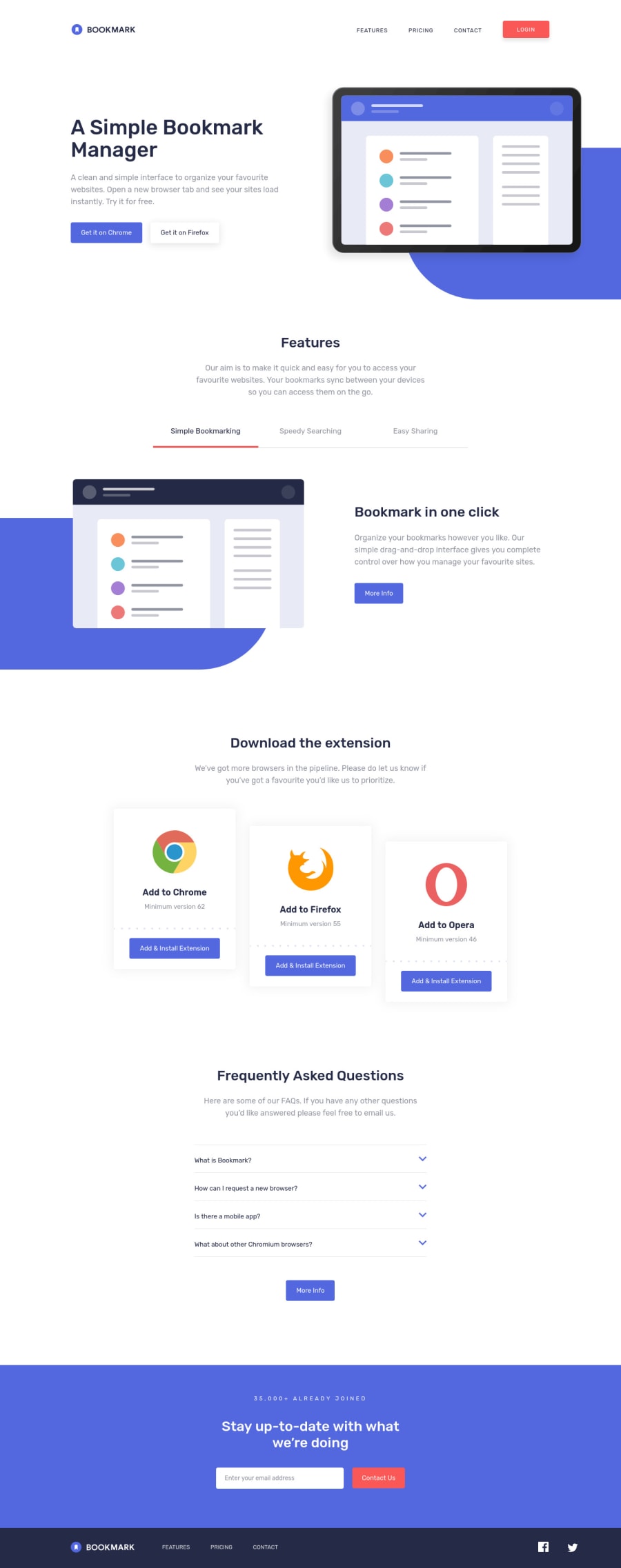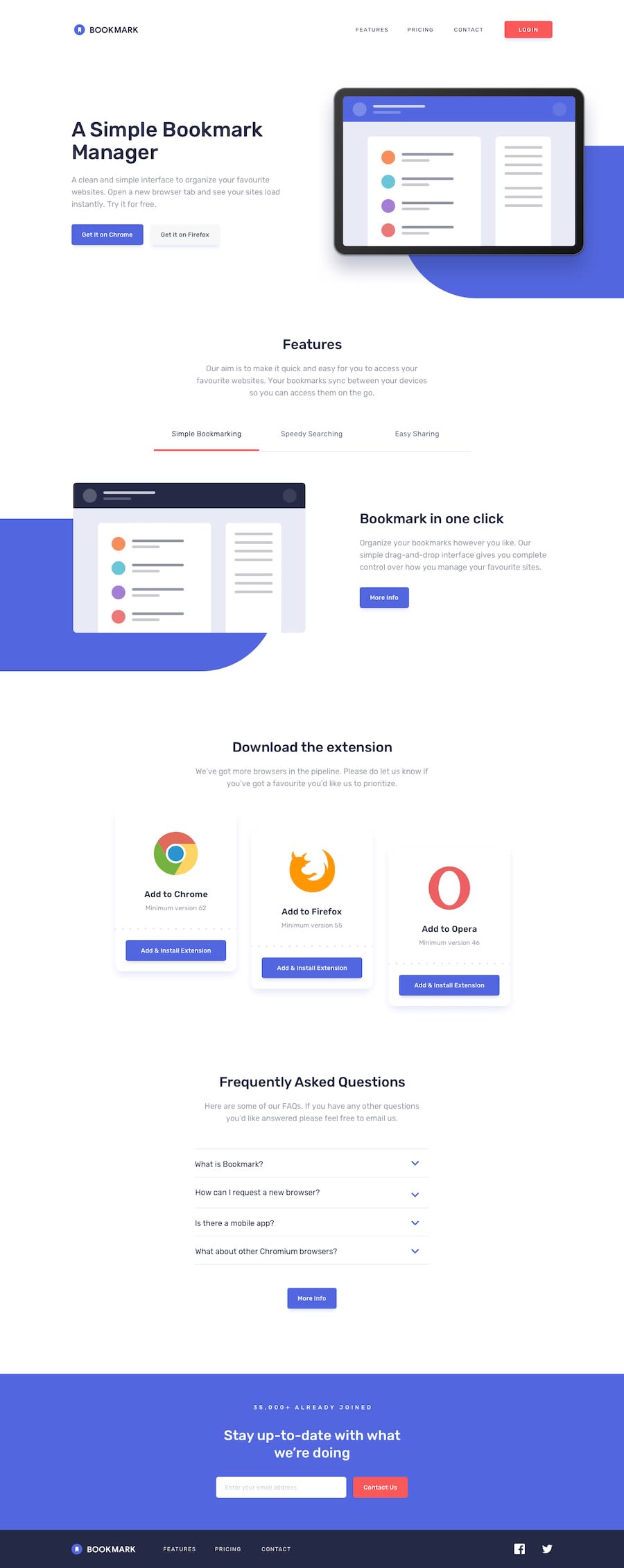
Design comparison
Solution retrospective
Hey, here is my 20th challenge here in FEM.
The challenge was really fun to do so and really liked the simplicity of the design yet attractive. Could have added some animations but I thought it doesn't really need to be that flashy.
I wanted to make this via a frontend framework, however I still get the doubt of not feeling to learn a framework at this point but maybe I'll learn one after a month or few month.
Made use of a tabbed interface in the feature section and I hope I implemented it the right way.
If there are any issues or anything that can help with the site, feel free to drop it^^
Community feedback
- Account deleted
Between 968px and 800px the FAQ section is literally on top of the opera card. And when on mobile and then switch to desktop while the mobile menu is still active, the logo does not switch back to the default one.
Other than those things, I think your solution is pretty much ok.
Keep coding👍.
Marked as helpful2@pikapikamartPosted almost 4 years ago@thulanigamtee oh yes, I messed that one up, I forgot to check since I added a
max-heighton that section and that made the faq be on top. Thank you saying that one ^0 - @ApplePieGiraffePosted almost 4 years ago
Hey, Raymart Pamplona! 👋
Congratulations on completing your 20th challenge here on Frontend Mentor! 🎉 Great job on this one! 👏 Your solution looks really good and I like the extra features you added (such as the notification that pops up when a user submits a valid email) and the smooth transitions you added to things (like the tabbed "Features" section and the mobile menu)! 🤩
I don't really have much to suggest since everything looks pretty on point! 👍
Maybe something a little extra (that would be a nice touch) would be to preload the illustration images for the tabbed "Features" section so that there is no delay between when a tab is shown for the first time and the image is loaded and appears. Doing just that is pretty easy and provides for a smoother UX. 😉
Keep coding (and happy coding, too)! 😁
Marked as helpful1@pikapikamartPosted almost 4 years ago@ApplePieGiraffe Hey, thanks APG for the compliments^
Also that preloading is pretty new to me, so really thank you for that one. Will implement it after I read and understand about it!
Also, question about it. For example if I have a website that don't have like that functionality, like the tabbed interface with the image loading or a gallery that uses of course images to display, just a website that uses bunch of images in different section. Would it also be wise to preload those images?
1@ApplePieGiraffePosted almost 4 years ago@pikamart
Great! 👍 Glad to help! 😀
I think the reason the images in the tabbed section of the page don't get displayed immediately when the other tabs are clicked is because they are only loaded when the
srcattribute of the<img>tag changes. Before that, the website doesn't "know" that those images exist.I think it's a nice idea to preload images when you have a few of them that are used in a case like this. Preloading many images (or very large ones) might slow down your site, though.
Optimally, you could lazy-load images that are used elsewhere on a page but aren't seen when the page is first loaded. That means you'll set up your webpage to detect when the user scrolls to those sections containing those images and only load those images when the user reaches or gets near to those sections. (Here's an article from CSS Tricks on lazy-loading images if you'd like to learn more.) That way, your site will only load the resources it needs at the right times. 😉 Maybe that's what you're looking for!
Hope that helps. Let me know if you have any other questions! 🙂
0@pikapikamartPosted almost 4 years ago@ApplePieGiraffe Thank you for making it clearer, I read some about the preloading but it just always states that they make ux lot smoother but doesn't really described "how" and you made it clear for me, by that the browser doesn't know the images until the
srcattribute is changed so like when preloading is used, it is like caching right, so yes really useful by that.Thanks a lot APG!
1 - @ConradMcGrifterPosted almost 4 years ago
really nice job
0 - @aUnicornDevPosted almost 4 years ago
Just wanted to confirm if the
:hoverstate on social icons on mobile layout is not working.Was it a choice or something that you missed?
0@pikapikamartPosted almost 4 years ago@aUnicornDev Hey, you don't really need a
hoverstate on a mobile preview. Since phone user just "touch" the screen thus not needing any cursor. Leaving thehoverstate on desktop preview is the right way^1
Please log in to post a comment
Log in with GitHubJoin our Discord community
Join thousands of Frontend Mentor community members taking the challenges, sharing resources, helping each other, and chatting about all things front-end!
Join our Discord
