Mobile first, SCSS and Javascript landing page bundled with Vite.JS
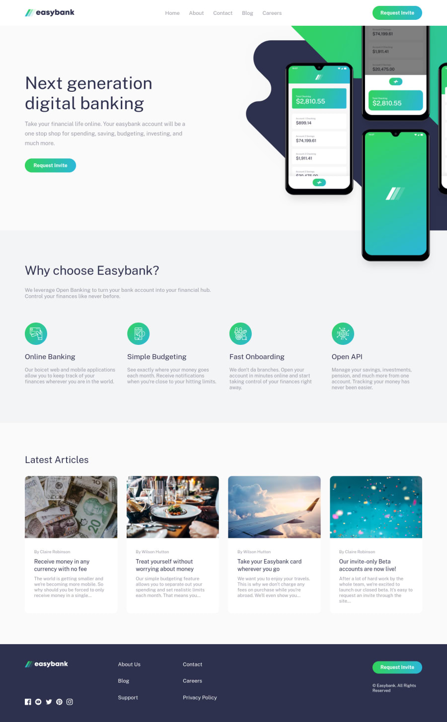
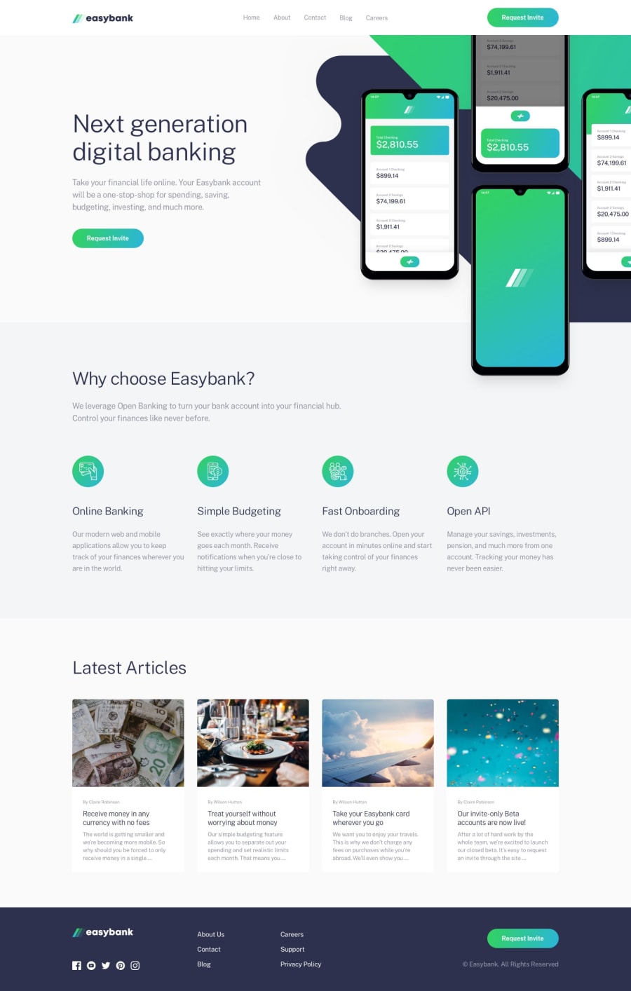
Design comparison
Solution retrospective
The hero section, omg...
Very hard! I was dealing with overflows, z-index, a lot of stuff that complicated everything lol! But that's it, I feel way more comfortable working with that weird stuff now.
But overall, I liked the final result. What do you guys think?
Community feedback
- @aUnicornDevPosted over 3 years ago
The footer is a little misaligned. The *Request Invite * button is pushed towards right because of the
grid-template-columns:1fr 8fr 1fr;and because the.footer__navbaris usingjustify-self:left;.Usingjustify-self:centerwill work.On tablet and mobile screens, the Hero section headline is pushed down too much. You can use a
margin-top:-80px;on.hero__text-area.Marked as helpful1@yasssuzPosted over 3 years ago@aUnicornDev hi Yashasvi, thanks for your feedback :D
I will take a look at these design incompatibilities and I will commit them soon :)
Thanks again and happy coding ;)
0 - @ixtkPosted over 3 years ago
Very clean, I love it. Make sure to check the report and fix the issues though
1@yasssuzPosted over 3 years ago@ixtk Thank you :D
yeah I will take a look at the report and fix everything :)
0
Please log in to post a comment
Log in with GitHubJoin our Discord community
Join thousands of Frontend Mentor community members taking the challenges, sharing resources, helping each other, and chatting about all things front-end!
Join our Discord
