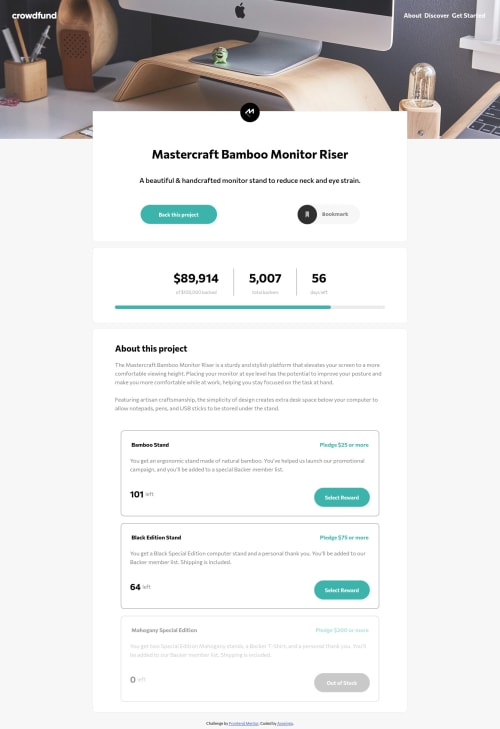
Submitted over 4 years agoA solution to the Crowdfunding product page challenge
Mobile first, SASS + vanilla JS!
@axseinga

Solution retrospective
Hi there!
This project took me a very long time as I was coming back and forth to it many times. After I finished most of the styling I got focused on practicing pure JS doing other projects and exercises. So in the end my code looks like nice spaghetti code but I am proud I finally finished it as it feels like forever compared to other projects from Frondend Mentor.
I will appreciate all comments and feedback on how I can improve my code. If you find any bugs, just let me know!
Thank you!
Code
Loading...
Please log in to post a comment
Log in with GitHubCommunity feedback
No feedback yet. Be the first to give feedback on Axseinga's solution.
Join our Discord community
Join thousands of Frontend Mentor community members taking the challenges, sharing resources, helping each other, and chatting about all things front-end!
Join our Discord