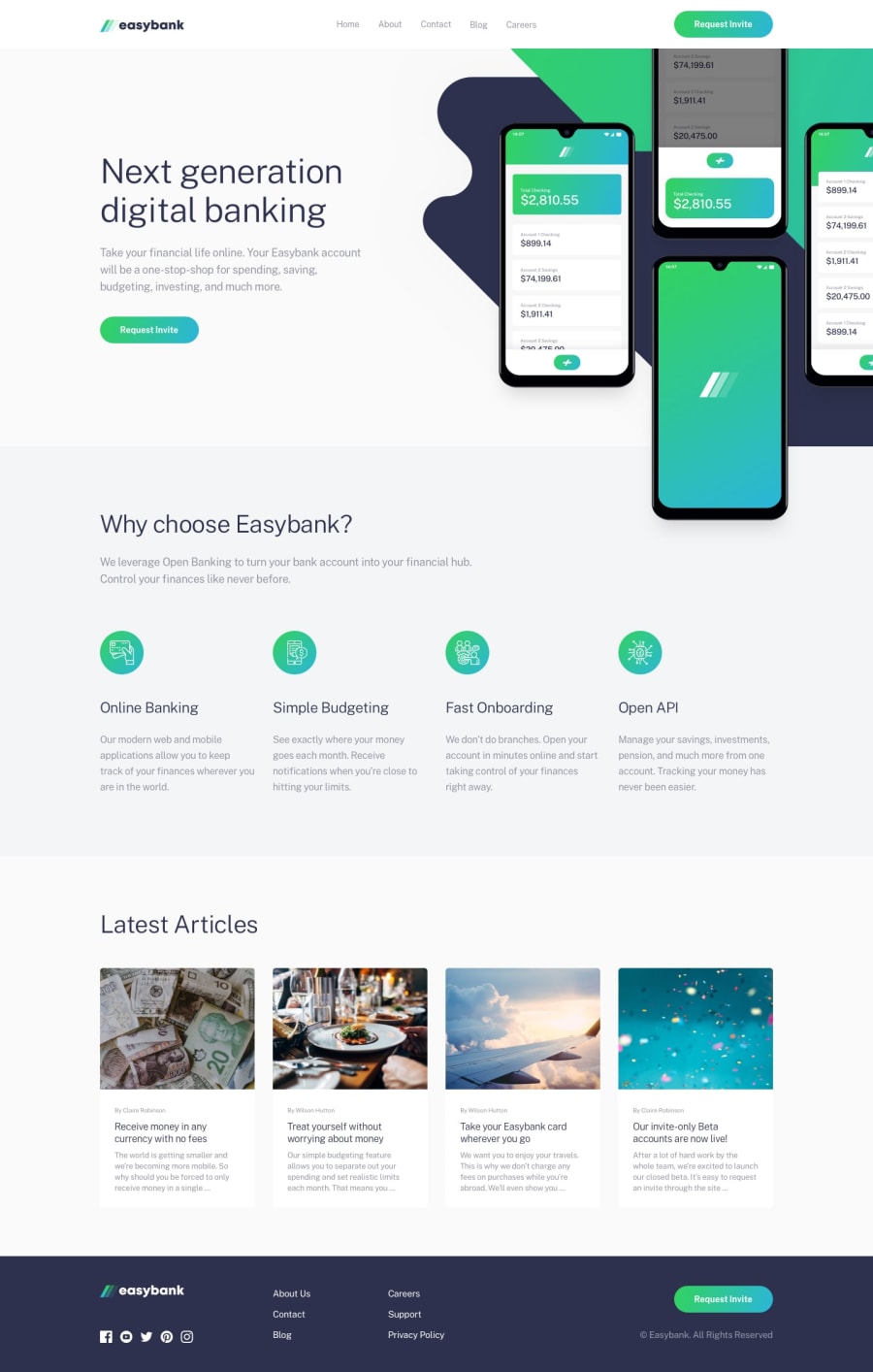
Mobile First, Sass (SCSS) + BEM, JavaScript and Flexbox + Grid
Design comparison
Solution retrospective
Any feedback would be highly appreciated! 😊
Community feedback
- @RocTanweerPosted over 3 years ago
Hello, I just did the same one today, really glad to see the same thing I did...
One thing I would suggest is that there should be text align center on two headings...
Hope it helps 😉
1 - @ApplePieGiraffePosted almost 4 years ago
Hey, Guilherme Magno! 👋
It's great to see you back! 😀 Good work on this challenge! 👍 I think your solution looks great and is responsive! 🙌 I also like the smooth transition of the mobile navigation! 👏 The favicon you added is nice, too!
I just noticed that the social media icons in the footer of the page aren't showing (their alt text or something is showing up instead). You might want to look into that and fix it! 😉
Keep coding (and happy coding, too)! 😁
1@devMagnoPosted almost 4 years agoThanks for your feedback, it is really good to be back! 😁
The icons are showing up properly here but I'll take a look at it, thanks!
1@devMagnoPosted almost 4 years agoI've made some small changes on those icons semantic using aria-label, is it working properly now?
1@ApplePieGiraffePosted over 3 years ago@devMagno
Perfect! 😀 The icons are working just fine, now! 👍
1
Please log in to post a comment
Log in with GitHubJoin our Discord community
Join thousands of Frontend Mentor community members taking the challenges, sharing resources, helping each other, and chatting about all things front-end!
Join our Discord
