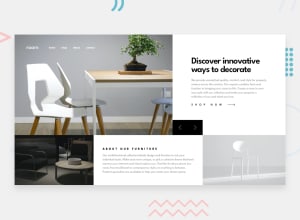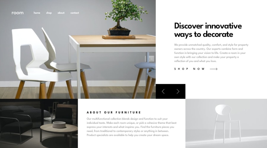
Mobile FirsT Room Homepage Using HTML, CSS, JS
Design comparison
Solution retrospective
tried to make it as responsive as i can. added some of my own design at tablet Viewport please do check it.
feedback are always welcome
Community feedback
- @palgrammingPosted over 3 years ago
you need to double check your flippers buttons like at 1000px wide and also at 800px wide
0@Amanpatil-DevPosted over 3 years agoyeah it breaks thanks for pointing i will correct it
0@palgrammingPosted over 3 years ago@Amanpatil-Dev look at 775px wide and then look at 765px wide
0@Amanpatil-DevPosted over 3 years ago@palgramming should i decrease the length of flipper buttons?
0@palgrammingPosted over 3 years ago@Amanpatil-Dev well it is changing position on the page but I do not think they need to be as wide so if making them smaller solves the location change issue then that should work. At 765 the flipper in on the bottom right of the photo at 775px it is below the shop now text
0@Amanpatil-DevPosted over 3 years ago@palgramming actually i didnt have the tablet version design so i assumed that below 768px flipper should go at bottom of the photo
0
Please log in to post a comment
Log in with GitHubJoin our Discord community
Join thousands of Frontend Mentor community members taking the challenges, sharing resources, helping each other, and chatting about all things front-end!
Join our Discord
