REST Countries API using React
Design comparison
Solution retrospective
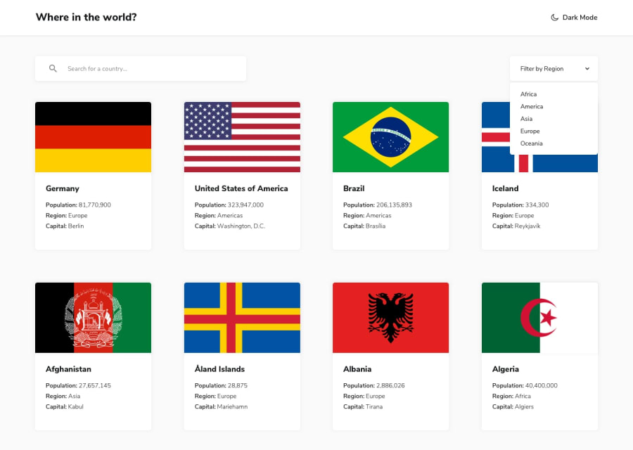
The thing I struggled with the most for this project is the Filter by Region dropdown menu. I originally used a <select> element until I realised I wouldn't be able to style it. Then I created a custom dropdown menu but was uncertain how to make it accessible so I ultimately switched back to the <select> element. If anyone has any feedback/suggestions on how best to implement the Filter by Region dropdown menu, please let me know.
I'd also appreciate any advice/thoughts/suggestions on wrapping the card in an anchor tag. I've read that putting that much content in an anchor tag is bad practice with respect to accessibility but I wasn't sure how else to implement clicking to see more detailed information about a country and making the clickable element obvious.
Community feedback
- @denieldenPosted almost 3 years ago
Hi Nakoya, great work on this challenge! 😉
Here are a few tips for improve your code:
- remove all unnecessary code, the less you write the better as well as being clearer: for example the
divcontainer of flag image - if I type a query that doesn't give any results, nothing happens, try adding a "no results" message
- I would also add a query reset button, I find it very convenient
- in the filters there is no way to return to all countries after choosing a region, add an entry "all region"
- for the details of countries you can use
ulistead a multiplep - if I open a country that has some undefined data, such as Antarctica, the details page crash and remains blank because it cannot cycle through non-existent data. Add a pre-check of the data before cycling it
- using
ais fine, alternatively you can hook aclickevent with javascript on cards
Overall you did well 😁 Hope this help!
Marked as helpful0@nakoyawilsonPosted almost 3 years ago@denielden Thanks for the feedback and suggestions. I'll try to incorporate it into my project. I have an "All regions" option in the custom dropdown component I created. Forgot to add it to the
<select>element when I switched back to using that. For the search input, the search is updated as you type and if the field becomes an empty string it goes back to all countries. I'll consider adding the reset button to make that clearer.1@nakoyawilsonPosted almost 3 years ago@denielden I'm trying to implement some of your suggestions. You mentioned if you open a country such as Antarctica the details page crashes but I'm checking and Antartica isn't a country option for me. How did you get Antarctica as an option?
1@denieldenPosted almost 3 years ago@nakoyawilson search for it via search input, it has a blue flag with white earth in the center :)
0@nakoyawilsonPosted almost 3 years ago@denielden I was searching for it and relying on the search by partial name feature of the API. After trying out the end point for a bit it appears that results for Antarctica only appear if the full name is typed. From "Anta" to "Antarctic" no results found is displayed. Thanks for pointing this out.
1@denieldenPosted almost 3 years ago@nakoyawilson exactly, glad I was helpful :) Keep it up and happy coding!
0 - remove all unnecessary code, the less you write the better as well as being clearer: for example the
Please log in to post a comment
Log in with GitHubJoin our Discord community
Join thousands of Frontend Mentor community members taking the challenges, sharing resources, helping each other, and chatting about all things front-end!
Join our Discord
