Design comparison
Solution retrospective
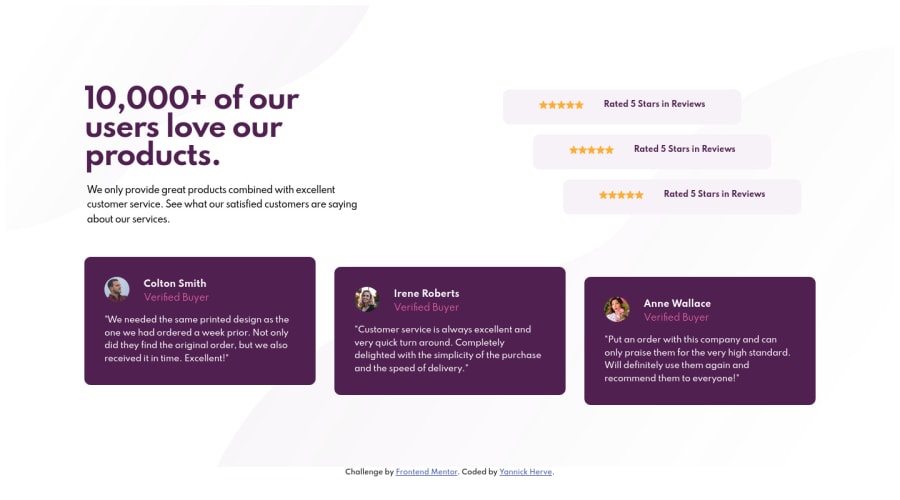
I recently started with css. Please tell me what you think of the mobile first approach and the quality of the code. Some breakpoints you recommend. Thank you !
Community feedback
- @grace-snowPosted almost 4 years ago
Hi, code and outcome both look good on this
Your stars look smaller than the design and have you just written in icons for those? That could cause rendering issues for some people, so it's considered best to use svgs in img tags or background images for these. Also they don't need to be in a paragraph tag. If you do them like this, they'd need to be in a span with an attribute of aria-hidden set to true.
I hope that's helpful feedback ☺
1@tesla-ambassadorPosted almost 4 years ago@grace-snow The stars should also be spaced some more. Plus the shade of color of the stars should be a little darker.
0@yannickhervePosted almost 4 years ago@grace-snow
Hi thanks for your feedback this help is really helpful.
0 - @janegcaPosted almost 4 years ago
Hi Yan, your code is clear and easy to follow and the site looks good on different sized screens. One suggestion, the design calls for the paragraph text under the header to be hsl(301, 10%, 53%), not black.
Nice job :)
0
Please log in to post a comment
Log in with GitHubJoin our Discord community
Join thousands of Frontend Mentor community members taking the challenges, sharing resources, helping each other, and chatting about all things front-end!
Join our Discord
