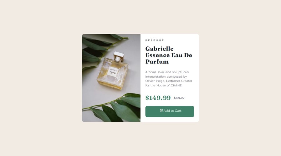
Mobile First Responsive Product Card Design


Design comparison

Solution retrospective
As the title suggest I took the mobile first approach in the making of this however I struggled with getting the responsive image in place due to how browser works (using cache) I couldn't tell if the changes works till I figured that out from a Kevin Powell's video I learnt a lot doing this mobile first approach I can see why its really popular note : during the test it only works first time unless you refresh the page cause once the image is loaded in the big screen it stays in the mobile version unless you refresh i don't know if this is the way in all browsers or just chrome thank you for checking this out i did minimize media query code here i would like to use even less queries in the future
What challenges did you encounter, and how did you overcome them?getting the responsive image to works srcset property and the pain of testing it in chrome (till i disabled cache later ) using less media queries or less code with in the query
What specific areas of your project would you like help with?any tips or criticism of my code will be highly appreciated as I learnt a lot from previous comments on my challenges thank you
Community feedback
Please log in to post a comment
Log in with GitHub
Join our Discord community
Join thousands of Frontend Mentor community members taking the challenges, sharing resources, helping each other, and chatting about all things front-end!
Join our Discord