Design comparison
Solution retrospective
First, please take note of the fact that this is a rather old project. It was, in fact, one of the first I completed after discovering Frontend Mentor so it may not be up to standard with my current work.
The thing I was proud of at the time was that I finished it. This was part of a streak of project completions done to be able to point to and tell myself I knew how to build things with html and css.
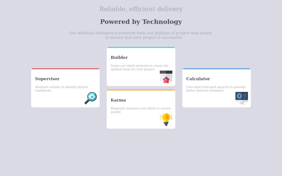
What challenges did you encounter, and how did you overcome them?The "plus formation" of the cards was a tiny bit tricky and necessitated some creative use of html elements to ensure the display would work correctly.
What specific areas of your project would you like help with?Nothing really comes to mind. There are issues but this is such an old project that it isn't worth it for me to do anything. If I did decide to address any of them, I would just restart the project from scratch instead.
Community feedback
- Account deleted1@ShaunPourPosted over 2 years ago
@zauri-khutsishvili Thanks! I do know grid but I just don't use it much for whatever reason.
0 - @cluod-AlfakhrePosted over 2 years ago
just a simple thing to add will make your solution perfect .
first to change your background to white.
second - add to your "container" these properties for the big screens : "display: flex; align-items: center; gap: 2rem;"
i'll be happy to answer any question
0
Please log in to post a comment
Log in with GitHubJoin our Discord community
Join thousands of Frontend Mentor community members taking the challenges, sharing resources, helping each other, and chatting about all things front-end!
Join our Discord
