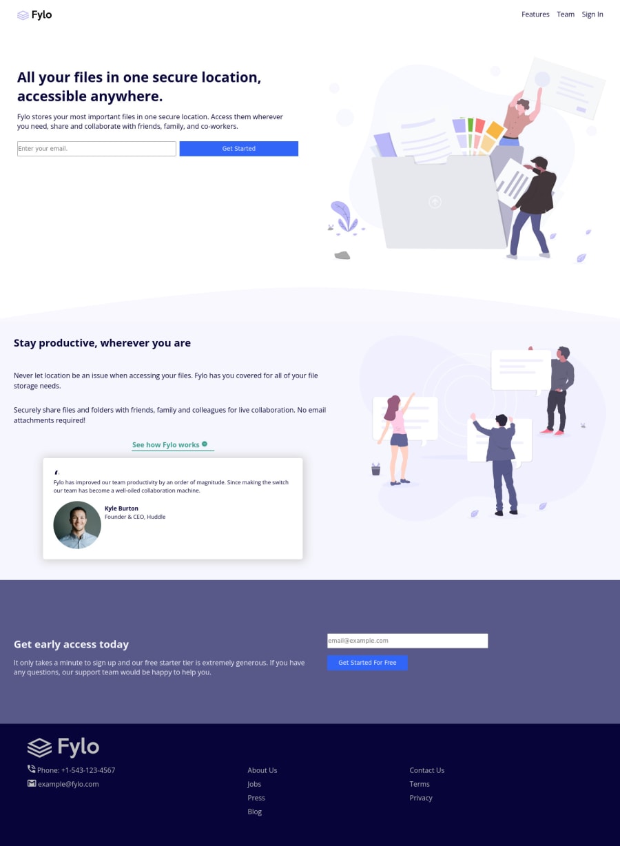
Mobile first , responsive design using css grid and flexbox
Design comparison
Solution retrospective
Feel free to send your feedback. It will help me to improve and to code more. thanks
Community feedback
- @Jawha3Posted about 3 years ago
Hey @ejbeloso, great effort!
There's a few things that stand out to me when looking at your solution that I think you could work on to at least improve the next solutions you build.
The overall layout itself is pretty much identical to the mockup (design) with the two columns, however the margins are too small which makes it look more off compared to the mockup. When you don't have access to the mockup it can be tricky to get the right margin and whatnot but I'm certain you can train your eyes to get close enough to the design.
There's also a few other things that stood out to me - the font color in the CTA and Footer sections are grey rather than white and the font sizes are slightly off as well - this of course being something you will train your eyes to notice over time.
Looking at the code I'd suggest looking into HTML Semantics to avoid having a million <div> tags.
If you are serious about getting better at frontend I strongly suggest becoming Premium to get access to the mockups - it helped me a great deal.
Keep up the great work!
EDIT: I also just noticed you didn't add the social media links ;)
Marked as helpful1@ejbelosoPosted about 3 years ago@Jawha3 thank you so much for your feedback. This will help me a lot on my next projects. I'm still at my newbie stage in this career and I really need this kind of feedback. Thank you again.
0
Please log in to post a comment
Log in with GitHubJoin our Discord community
Join thousands of Frontend Mentor community members taking the challenges, sharing resources, helping each other, and chatting about all things front-end!
Join our Discord
