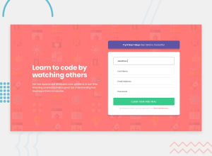
Mobile first responsive design CSS , JavaScript, HTML
Design comparison
Solution retrospective
Any comments and suggestions will be appreciated. Thank you.
Community feedback
- @ApplePieGiraffePosted almost 4 years ago
Hey, Dexter Dick! 👋
Nice job on this challenge! 👍
I suggest,
- Adding a
max-widthto the main container or wrapper so that the content of the page doesn't look too stretched on extra-large screens. - Decreasing the font-size of the text in the desktop layout just a little (as in the original design).
- If you can, removing the error message on each of the input elements once some valid input has been entered (rather than wait for the user to hit the submit button again before clearing the error messages) would be nice for a slightly better UX.
Keep coding (and happy coding, too)! 😁
1@DexterDickPosted almost 4 years ago@ApplePieGiraffe, Thank you for your feedback much appreciated. I implemented some of your recommendations.
0 - Adding a
- @MasterDev333Posted almost 4 years ago
Great work. Fully responsive and close to design. However, it would be great if you use a tag for Terms and Services, rather than span. And add transition effects button to make smooth animation. transition: .3s all ease-in-out; Hope this helps. Happy coding~ :)
0@DexterDickPosted almost 4 years ago@MasterDev333 Thank you Master Dev333. I made some of your recommendations. Thank you for your feedback.
0
Please log in to post a comment
Log in with GitHubJoin our Discord community
Join thousands of Frontend Mentor community members taking the challenges, sharing resources, helping each other, and chatting about all things front-end!
Join our Discord
