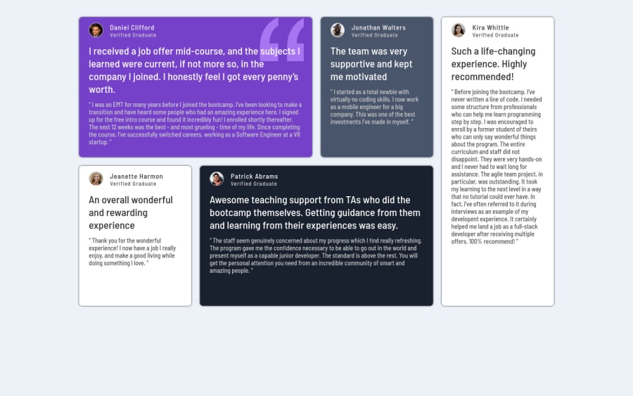
Mobile First, Responsive Design and CSS Grid
Design comparison
Solution retrospective
Can i borrow your time to view my project and leave some feedback? Thank you!
Community feedback
- @IEdiongPosted almost 3 years ago
Hello Hatwell 👋, great job completing this project. Here are some things I noticed:
- The
color
of the text is not as shown in the design guide. - You didn't use semantic tags eg
<section>
,<article>
etc - You still need to tweak your drop shadow a bit.
- You should look into the accessibility issue raised here.
I hope this was helpful, Shalom!
Marked as helpful1@hatwell-jonelPosted almost 3 years ago@IEdiong thank you for your informative feedback, i just don't get why there is an issue in accessibility specially this <html lang="en>. do you why? i read the article about this but still don't get it.
0@hatwell-jonelPosted almost 3 years ago@IEdiong also i view all your works here in FEM and it is awesome! how do you get the exact look of design like the exact position of the elements? do you have a tools to do that?
0@IEdiongPosted almost 3 years ago@hatwell-jonel No, I don't have like a special tool that I use. I simple take screenshots of my finished work (with firefox dev tools) and then compare them with the design picture. I currently can't afford the premium subscription so this is how I manage for now. It's tedious though but I believe that when I get the premium subscription, and as well the Figma files, it would be easier.
Marked as helpful1@IEdiongPosted almost 3 years ago@hatwell-jonel In the article linked to the
learn more
you see the below write up:How to Fix the Problem Ensure that the page or at least one of its frames contains a level-one heading.
Generally, it is a best practice to ensure that the beginning of a page's main content starts with a
h1
element, and also to ensure that the page containsonly one h1
element.Summary
-
Your page (<body> tag) should contain at least one
h1
tag or -
at least one of the sectional regions in your page should contain the
h1
tag.
So, what you're to do is to add a
h1
tag and with it's content being the page title or something. Then since there is no page title visible in the design, you can make theh1
not to be visible on your page.You can achieve this by adding a
.sr-only
class (which stands for screen reader) to theh1
tag or any other element that you want to be accessible by screen readers but not by visual users.You can google the text 'sr-only CSS class' and reuse one of the code snippets that you find for this or you could check out my solution to this challenge, and reuse the .sr-only class in your project.
Also, you should read up that article to know why this is important, it was an informative read for me.
I hope this was helpful, Shalom!
Marked as helpful1@IEdiongPosted almost 3 years ago@hatwell-jonel I'm glad I could help 🤗
Marked as helpful1@hatwell-jonelPosted almost 3 years ago@IEdiong i see i see, now i know what i am going to do. thanks to your explanation.
0 - The
Please log in to post a comment
Log in with GitHubJoin our Discord community
Join thousands of Frontend Mentor community members taking the challenges, sharing resources, helping each other, and chatting about all things front-end!
Join our Discord