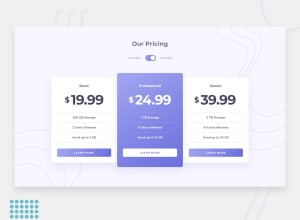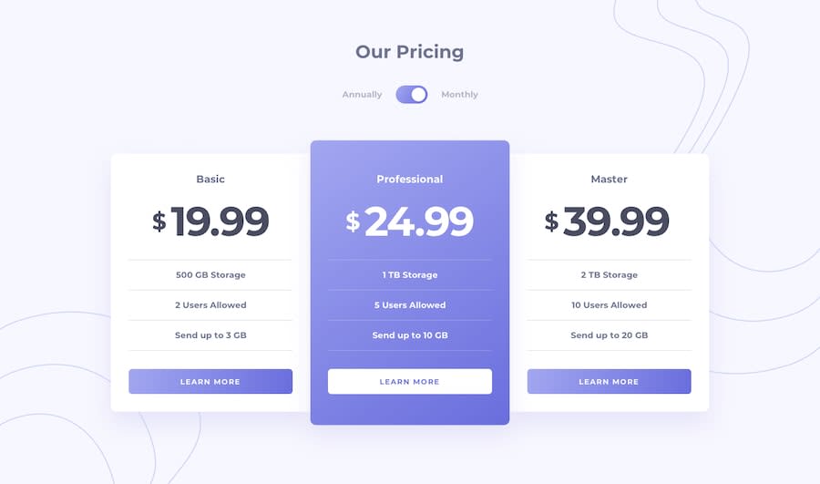
Mobile first responsive, BEM, CSS, JavaScript dynamic loaded content.
Design comparison
Solution retrospective
This is my first junior challenge feedback is welcome and appreciated. Thank you.
Community feedback
- @pikapikamartPosted over 3 years ago
Hey, great work on this one and congrats to your first junior challenge as well! Both desktop and mobile layout is really good.
Some suggestions would be that:
- Ughm well, it is a bit weird that your
buttonis moving especially when the focus is in it, it feels like it is not part of the toggle itself because the outline is in the button only. Well this is just preference, but you could make use of:focus-within, what will happen is that, when the button gets the focus, the toggle will have the outline, not the button itself. So if you were to implement this, it would look like
first set the `outline: none` to the button
then set this below

.toggle__switch:focus-within {

    outline: 3px solid red; it depends on your preference for the size and color

   You could instead use box-shadow instead of outline
}
This way, the button won't get that box-outline which is moving when toggled. The whole toggle will get the outline, thus creating this visual of being a whole.
- Use hierarchical header tags. On your article, you used
h3then followed byh2which creates conflict in terms of hierarchy. Use theh2first thenh3
Only those two. But still, you did a really good job on your first junior challenge^^
0@DexterDickPosted over 3 years ago@pikamart Thank you for your feedback. I implemented some of your changes.
I noticed my toggle button works on desktop but dose not show up mobile. I am not sure why this is happening.Thank you.
0 - Ughm well, it is a bit weird that your
Please log in to post a comment
Log in with GitHubJoin our Discord community
Join thousands of Frontend Mentor community members taking the challenges, sharing resources, helping each other, and chatting about all things front-end!
Join our Discord
