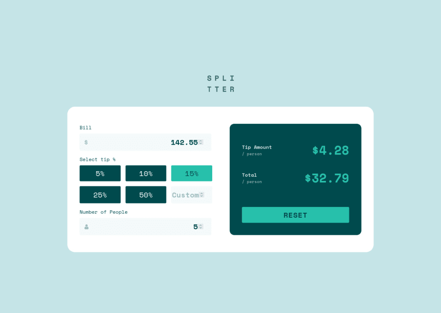
Design comparison
Solution retrospective
Hi Everyone,
I've just completed this challenge in React. I am more than happy to get some feedback.
Have a nice one! Anna
Community feedback
- @pikapikamartPosted about 3 years ago
Hey, awesome work on this one. Desktop layout is really great, it is responsive and the mobile state looks really great as well.
Alex already pointed great tips on this one which I agree as well. Just going to add some suggestions on the site as well:
main
tag is missing on this one. Always have amain
element to wrap the main content of your page. On this one, you could use amain
after the#root
selector to wrap all the content of the site. This way it will be inside a landmark element.- Use only
alt="splitter"
. When usingalt
attribute, avoid using words that relates to "graphic" such as "logo" and others. Animg
is already an image/graphic so no need to describe it as one. - Each icons on the left side of the
input
is just decoration. Decorative image must be hidden at all times by usingalt=""
and extraaria-hidden="true"
attribute on theimg
tag. - Adjust the
:focus-visible"
state of all the interactive elements. If you remove theoutline
property of an element, make sure to add another custom visual indicator on the element's:focus-visible
state. Try using tab on your keyboard to navigate the site, you will have a hard time since there is no indication on where you at. - I wouldn't use the
select tip
as thelabel
for the custom-input since the text is not suitable for theinput
. Theselect tip
could be a heading for the sets ofbutton
or it could be alegend
when you approached thebutton
as a set of radio buttons which is inside afieldset
. button
alone is not informative to users specially to people who are only using screen-reader. It would be a great idea to have anaria-live
element that will announce if a certainbutton
is pressed or selected, the live-element could say something like "5 percent selected" or other descriptive text. Just an idea^^tip-amount
andtotal
could use a heading tag since it gives overview on what the section would contain.- When wrapping a text-content do not just use
div, small
to wrap it, use meaningful element like ap
tag if it just a regular text or heading tag if it is an heading. - Do not directly type the wordings as uppercase on the markup, if you do this, screen-reader will read the text letter-by-letter and not by the wordings. Use only the lowercase version to write in the markup and instead use
text-transform: uppercase
on it. - Lastly, another idea is to create or used an existing
aria-live
that will announce if theform
has reset if the users presses the reset-button.
Aside from those, the site looks great and awesome job again on this one.
Marked as helpful0@annacsillaxsPosted about 3 years ago@pikamart Thank you for that feedback, this is awesome!
I've had no idea about most of the things you've mentioned. I really appreciate it. I'll look into them and implement them in the project!1 - @AlexKMarshallPosted about 3 years ago
This is excellent. It looks great, and the functionality works well.
If I were to offer a couple of pointers:
You have multiple forms wrapping the various inputs. I would make that just one as everything works together, they're not really separate things.
I like that you're using real buttons and real inputs which helps a lot with accessibility. But the buttons don't have a focus style, so you can't see which is selected when using a keyboard. And the Bill amount input needs a label of some kind.
For the React code, you're using a lot of querySelectors to access the DOM nodes directly and manipulate them. That's not a very idiomatic way of doing things with React. For instance for applying a conditional className you can do that directly in the JSX with a ternary statement based on the active state value. Even better you could use the aria-pressed value to set the active button and then target that directly in the css, avoiding the need for extra class names. This is a good article on that concept https://adrianroselli.com/2021/06/using-css-to-enforce-accessibility.html and this one is too https://inclusive-components.design/toggle-button/
In general this is a really good submission though. These are mostly fairly picky comments that could take it to the next level.
Great work.
Marked as helpful0@annacsillaxsPosted about 3 years ago@AlexKMarshall thank you for your feedback!
I'll definitely look into that article. This was my first react app totally on my own and I had the same feeling that I use more js than react 😅
0
Please log in to post a comment
Log in with GitHubJoin our Discord community
Join thousands of Frontend Mentor community members taking the challenges, sharing resources, helping each other, and chatting about all things front-end!
Join our Discord