Submitted over 1 year agoA solution to the Recipe page challenge
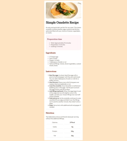
Mobile First Recipe Book component using flex box
@hirakjsarma

Solution retrospective
What are you most proud of, and what would you do differently next time?
I have a learnt a lot of things inside HTML. There are certain things that I had overlooked but after making this project things became clear to me.
What challenges did you encounter, and how did you overcome them?I have face many challenges during this. Specifically, while making the the divider element or in making the table section.
What specific areas of your project would you like help with?Help me in writing this code in a more efficient way.
Code
Loading...
Please log in to post a comment
Log in with GitHubCommunity feedback
No feedback yet. Be the first to give feedback on Hirak J Sarma's solution.
Join our Discord community
Join thousands of Frontend Mentor community members taking the challenges, sharing resources, helping each other, and chatting about all things front-end!
Join our Discord