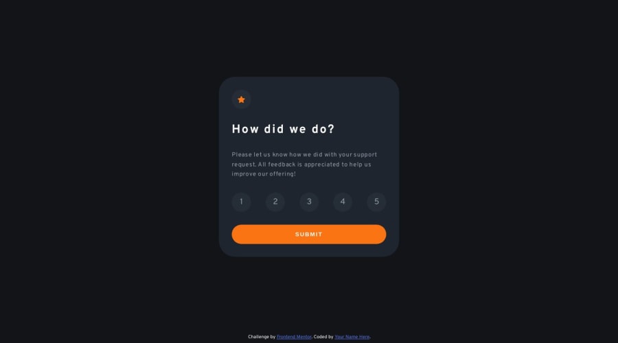
Mobile first rating component using Flexbox and JavaScript DOM
Design comparison
Solution retrospective
How can I make this component more accessible? Are there any issues with the units i have used in CSS? Did I use the ARIA roles and properties correctly? I couldn't make the circles around the icon and rating options center the element they are containing. How could i have achieved this?
Community feedback
- @yefreescodingPosted over 1 year ago
👋 I can give you some tips and advice and, I'll try to give you a good answer for each one of your questions:
- How can I make this component more accessible?
To make your code, or this component more specifically, more accesible you should use semantic HTML tags such as header, main, section, aside, article, h1, h2, quote, form. Checking your code I found some issues, there's way too many <div> 😅. You did a great job tho naming the classes, but to make your code more readable you can do something like this:
<div class="wrapper flex-col"> <main class="rating-wrapper"> <article class="rating-component"> <div class="star-icon"></div> <h1 class="rating-title">How did we do?</h1> <p class="rating-description">Please let us kno [...]</p> </article> <form class="rating-form"> <input type="radio" name="rating" value="1" class="user-rating-button" checked>1</input> <input type="radio" name="rating" value="2" class="user-rating-button" checked>2</input> <input type="radio" name="rating" value="3" class="user-rating-button" checked>3</input> <input type="radio" name="rating" value="4" class="user-rating-button" checked>4</input> <input type="radio" name="rating" value="5" class="user-rating-button" checked>5</input> <button type="submit"> Submit</button> </form> </main> </div>
I think this would be a more semantic and cleaner solution.
Pro tips 💪🤓:
- Less code means better results.
- When coding, embrace a team mentality. Comment your files, format your code consistently, create a descriptive README, and write semantic, understandable code, etc.
- Always keep an open mind.
Overall, your solution looks fantastic and works smoothly. You're on the right path. I hope these tips will help you improve as a developer.
Marked as helpful1
Please log in to post a comment
Log in with GitHubJoin our Discord community
Join thousands of Frontend Mentor community members taking the challenges, sharing resources, helping each other, and chatting about all things front-end!
Join our Discord