Not Found
Not Found
Not Found
Not Found
Not Found
Not Found
Not Found
Not Found
Not Found
Not Found
Not Found
Not Found
Not Found
Not Found
Not Found
Not Found
Not Found
Not Found
Not Found
Not Found

Submitted

Mobile First-QR Code Componenet

@Manshiporiya

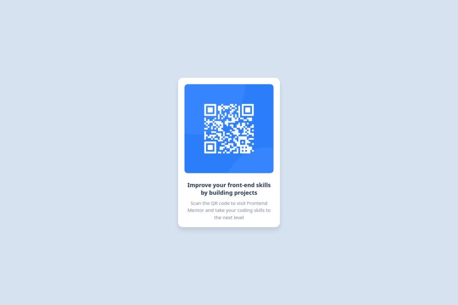
Desktop design screenshot for the QR code component coding challenge

This is a solution for...

  • HTML
  • CSS
1newbie
View challenge

Design comparison


SolutionDesign

Solution retrospective


What are you most proud of, and what would you do differently next time?

I’m most proud of successfully creating a fully responsive landing page using only CSS. The design adjusts well to different screen sizes, offering a seamless user experience on mobile, tablet, and desktop. I also enjoyed experimenting with CSS Flexbox for layout management and improving the page’s visual appeal through custom styling.

What would you do differently next time? Next time, I would aim to implement more advanced CSS techniques like CSS Grid for complex layouts. I would also focus on optimizing page load times by reducing the number of external assets, such as fonts and images, and perhaps explore CSS animations to add interactivity. Additionally, I would spend more time refining accessibility features to ensure the site is more user-friendly for individuals with disabilities.

What challenges did you encounter, and how did you overcome them?

Responsive layout issues: The page didn’t look good on all screen sizes at first.

Solution: Used Flexbox and media queries to fix alignment and spacing. Cross-browser compatibility: Styles looked different on some browsers.

Solution: Added vendor prefixes and tested across multiple browsers. Design consistency: Some elements had uneven spacing.

Solution: Simplified the CSS by reusing classes for common styles.

What specific areas of your project would you like help with?

CSS Optimization: I'd appreciate feedback on how to further optimize my CSS code to reduce redundancy and improve maintainability. Are there specific areas where I could simplify the styling or use more efficient techniques?

Responsive Design Enhancements: While I used media queries and Flexbox, I’d like suggestions on improving the responsiveness, especially for more complex layouts. Any tips on making the design more fluid for various screen sizes?

Cross-browser Compatibility: I'm looking for feedback on ensuring better compatibility with older browsers. Are there any tools or techniques I may have missed to help with this?

Performance Optimization: Are there ways to improve page load speed, particularly regarding CSS? For example, any tips on reducing file size or improving rendering times?

These areas would greatly benefit from expert input to make the project even more robust and efficient.

Community feedback

geomydas 1,060

@geomydas

Posted

Hi @Manshiporiya, I have recently just finished checking your code and it looks good but it seems to have few issues which can easily be fixed.

My Feedback

  1. You shouldn't worry about browser compatiblity that much. Check out this handy website for deciding if a property is outdated or not. You would only worry about browser compatibility on very niche features such as animating from display: none or stuff similar to that.
  2. Consider using a CSS reset, it basicall makes your css look the same in most browsers and makes it more consistent aswell. You dont have to do anything that much since you only need to copy and paste it inside your code and you are all set. I reccomend using josh comeau or andy bell css reset as most people use them
  3. Learn to use the rem unit. The rem unit is typically used in place of px and it makes your websites more accesible as it scales with the users set font size in the browser settings. You would typically use px for small stuff such as borders, outlines and shadows and rem for the rest. To be more specific than that, you would use rem if you want to scale with the users set font size which is the case most of the time
  4. Never ever set font-sizes and media queries in px and instead use rem/em. Using px is an accesibility issue for this case and I won't dive deeper into that since you should check out this resource
  5. Your site needs a main landmark. All sites should have atleast 1 main landmark for enhanced accesibility, consider replacing the div with the class of card with a main tag instead
  6. Remove the media queries in the project. There is no need to do so. The font sizes dont even change from mobile to desktop, the paddings dont change either, no need to change the max-width as it will resize fluidly and automatically. Also, your styles in media queries do nothing since you are using the id selector instead of the class selector for the card
  7. Don't set font-family in the global selector. Just set it on the body and all of the elements will inherit it automatically, you would only reserve the global selector for setting box-sizing to border-box and resetting either margins or paddings.
  8. Don't use descendant selectors that often such as .card p as that will increase the specificity and therefore making it harder to override the styles in the future, even if you might think "oh, i wont override this" in most projects I have seen it being override or I completely forget it.
  9. Take a look at the BEM naming methodology and see if it helps you write better class names inside the HTML and write more better and maintainable CSS. It's not for everyone thought as it is verbose but I promise you to try it and you will fall in love immediately
  10. Remove the comments in the top part of the HTML. I don't see the need for it as it does not convey any meaning whatsoever. Comments are typically used as tips or warnings for future people who will take a look at your code. The comment at the top of your HTML however is just a copy of the document without the HTML tags.

It might seem overwhelming at first but treat it as a checkbox and you'll get it done in no time. Have a nice day and have fun coding!

1

@faraz-ch1

Posted

Nice work. If you give the container a specific width and give margin auto on both left and right the box will get in center, it'll be auto responsive on all screens.

0

Please log in to post a comment

Log in with GitHub
Discord logo

Join our Discord community

Join thousands of Frontend Mentor community members taking the challenges, sharing resources, helping each other, and chatting about all things front-end!

Join our Discord