Mobile first pure html and css solution trying out BEM
Design comparison
Solution retrospective
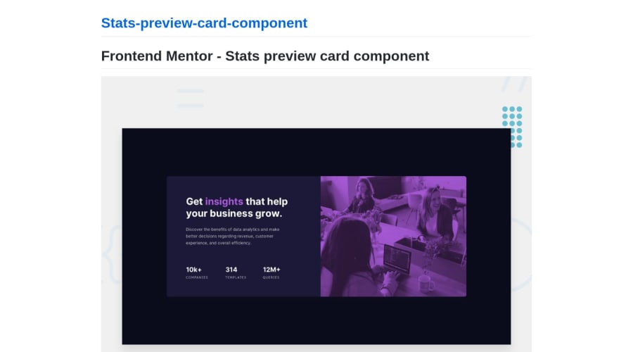
Hello there friends! this is my solution for the "Stats-preview-card". I'm happy for any tips you might have for a html and css beginner. I tried coding the mobile version first this time and using a media query to enable the desktop version. Any tips for improvement in that regard are very welcome as this was my first time using the media query. I also tried using the BEM methodology to name the classes at least. I wasn't to sure on the names for my containers. Are there any better class-names I could have used? Happy for your feedback :) Cheers Flo
Community feedback
- @pikapikamartPosted about 3 years ago
Hey, great work on this one. I think this is you first challenge here? If that's it, congrats^^. The site looks smaller in desktop though could be a bit more wider, though it is responsive which is great and the mobile state looks fine.
Some suggestions would be:
- Avoid using
height: 100vh
on a large container like thebody
tag as this limits the element's height based on the remaining screen's height. Instead usemin-height: 100vh
, this takes full height but lets the element expand if needed. - Always have a
main
element to wrap the main content of your page. On this one, the.card-container
should be using themain
instead ofdiv
. - The hero-section
img
could use a more descriptivealt
value if you think the image is meaningful. Because usingcard header image
as the text, it doesn't really describe what is the image itself right, so better using descriptivealt
. - Also when using
alt
attribute, avoid using words that relates to "graphic" such as "image" and others. Animg
is already an image/graphic so no need to describe it as one. - Your
.card__statistics-container
could have usedul
since those are "list" of information about the company website. -Also, inside in those list information, those text should not be using a heading tag because they don't really give content on what the section would contain right, so better usingp
tag on them. - Lastly, maybe widening the layout in desktop layout just a little bit:>>
If you have any queries just drop it here okay. Aside from those, great work again on this one.
1 - Avoid using
Please log in to post a comment
Log in with GitHubJoin our Discord community
Join thousands of Frontend Mentor community members taking the challenges, sharing resources, helping each other, and chatting about all things front-end!
Join our Discord