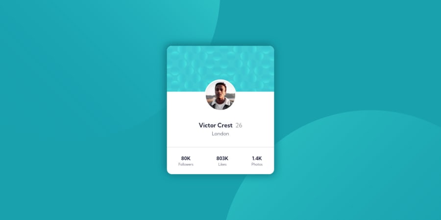
Design comparison
Solution retrospective
Hi everyone,
I have updated the solution acording to the feedback from the community, so hope it is better now :-)
Any other tips or feedback are really welcomed.
Have a nice coding day.
Community feedback
- @grace-snowPosted over 2 years ago
Hi
Your large padding on the card is making the content extremely narrow on my phone, every word on a new line even though there's plenty of space
I think you're misunderstanding when and how to use Sr only text here. Duplicating the content for screenreaders is completely unnecessary and in fact annoying for these users as everything will be read out twice here.
Have a look at my solution and see how you could use it to add labels just where you need to
Also, this kind of challenge isn't a full webpage so you really don't need to worry about a warning about no h1 on the page. This would never need a h1 if on a real webpage, it's just a single component.
That said, you should be using a heading for Victor's name as that is the heading that all the other content belongs to.
As an aside - not needed here - you might like to look up the description list element for future use when you have lists of key value pairs (like you've tried to add Sr only atm that isn't needed)
Marked as helpful3@IvuskaPosted over 2 years agoThank you a lot @grace-snow π.
I fixed some parts of my solution and also find a lot of inspiration for my further development in your repo. π
0 - @PhoenixDev22Posted almost 3 years ago
Hello @Ivuska,
I have few suggestions regarding your solution:
-
I have looked into your solution you already have used the flexbox properties and min-height : 100vh to the <body> to center the component on the middle of the page.
-
To tackle the accessibility issues, you can add a
<h1>
withclass="sr-only"
(Hidden visually, but present for assistive tech).
.sr-only { border: 0 !important; clip: rect(1px, 1px, 1px, 1px) !important; -webkit-clip-path: inset(50%) !important; clip-path: inset(50%) !important; height: 1px !important; margin: -1px !important; overflow: hidden !important; padding: 0 !important; position: absolute !important; width: 1px !important; white-space: nowrap !important; }
-
In here
<spanr-only">
, did you mean<span class="sr-only"
?(Hidden visually, but present for assistive tech). -
No need to mention photo in the alt text as Itβs going to be obvious to either a person or a machine when something they're accessing is alt text. Read more how to write an alt text
-
font-size: 1.125;
, the font size can't be unitless, better to use rem. -
width: 350px;
an explicit width is not a good way . Remove the width from the main
component and change it to
max width
instead. That will let it shrink a little when it needs to. Overall , your solution looks good .Hopefully this feedback helps.Marked as helpful3@IvuskaPosted over 2 years agoHi @PhoenixDev22,
thank you for your feedback and useful link about alt texts. I have updated the solution :-)
1 -
- @vanzasetiaPosted over 2 years ago
Hello, Iva! π
Congratulations on finishing this challenge! Your solution on my desktop and both landscape and portrait mode on my mobile view. π
You have received a lot of incredible feedback from others and I want to give a recommendation. I would recommend using CSS background properties for the bubble. By doing that, it will clean up your HTML a bit. You can play around with the
background-position
.I hope this information is useful! Keep up the good work! π
Marked as helpful1@IvuskaPosted over 2 years agoHi @vanzasetia,
thank you a lot for your feedback and tips π I tried to make some fixes in my solution.
1 - @GitHub-dev12345Posted almost 3 years ago
Congratulation ππ complete your challenge. Used this code want your card in center position :
in body tag Used this CSS Code: body{ display : flex; justify-content: center; align-item: center; }
in Card Design CSS Code used this property: align-self: center;
And give the maximum padding inner Card Design:
I hope you find this helpful π .
0
Please log in to post a comment
Log in with GitHubJoin our Discord community
Join thousands of Frontend Mentor community members taking the challenges, sharing resources, helping each other, and chatting about all things front-end!
Join our Discord