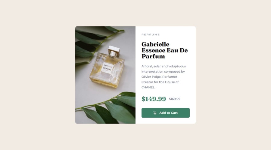
Design comparison
Solution retrospective
Well, it's not too far off from the design provided. Probably should have added another breakpoint, but it gets the job done. As a first attempt at mobile-first purely with code, it's fine.
What challenges did you encounter, and how did you overcome them?Tried to implement as many different new elements as I could. The stuff didn't give too much trouble, but typography was a real headache. Started with clamp(), but it messed with everything (content size, containers etc), so I just used "manual" measurements and @media. Not happy with that, it means I don't fully grasp how responsive text functions. Will try again in the next one.
What specific areas of your project would you like help with?Honestly, any tips for responsive typography and rem-based containers will be really appreciated. Maybe, I should have had a clamp() with my min and max font sizes, but I still struggle a bit to visualize how calc() works.
Community feedback
Please log in to post a comment
Log in with GitHubJoin our Discord community
Join thousands of Frontend Mentor community members taking the challenges, sharing resources, helping each other, and chatting about all things front-end!
Join our Discord
