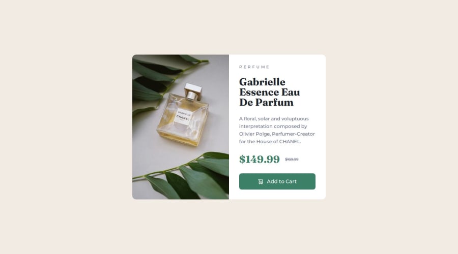
Mobile-First Product Card Component with CSS Custom Properties


Design comparison

Solution retrospective
I'm proud of implementing a mobile-first approach and using CSS custom properties for consistent theming. While I achieved a similar layout without Figma, next time I would use more precise measurements for spacing and typography, pay more attention to micro-interactions and transitions, implement better accessibility features, and consider using CSS Grid for more flexible layouts.
What challenges did you encounter, and how did you overcome them?The main challenge was transitioning from mobile to desktop layout. I overcame this by using flexbox direction change from column to row, implementing responsive image handling with the picture element, carefully managing spacing variables for different viewports, and adjusting content padding and gaps for better visual balance.
What specific areas of your project would you like help with?I would appreciate guidance on advanced CSS techniques beyond basic flexbox, best practices for responsive typography scaling, modern CSS features like Grid, clamp(), and custom properties, animation and transition implementations, and CSS architecture and organization for larger projects.

Join our Discord community
Join thousands of Frontend Mentor community members taking the challenges, sharing resources, helping each other, and chatting about all things front-end!
Join our Discord