

Design comparison
SolutionDesign

Solution retrospective
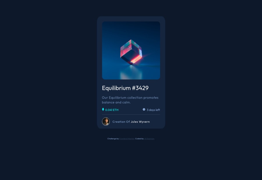
Here is my completed NFT Preview Card Project. I did have a hard time getting the hover state set for the main image, and I struggled lining up the icons with the wording to the right. Any suggestions on improving my code are welcome. Thank you!
Community feedback
Please log in to post a comment
Log in with GitHubJoin our Discord community
Join thousands of Frontend Mentor community members taking the challenges, sharing resources, helping each other, and chatting about all things front-end!
Join our Discord