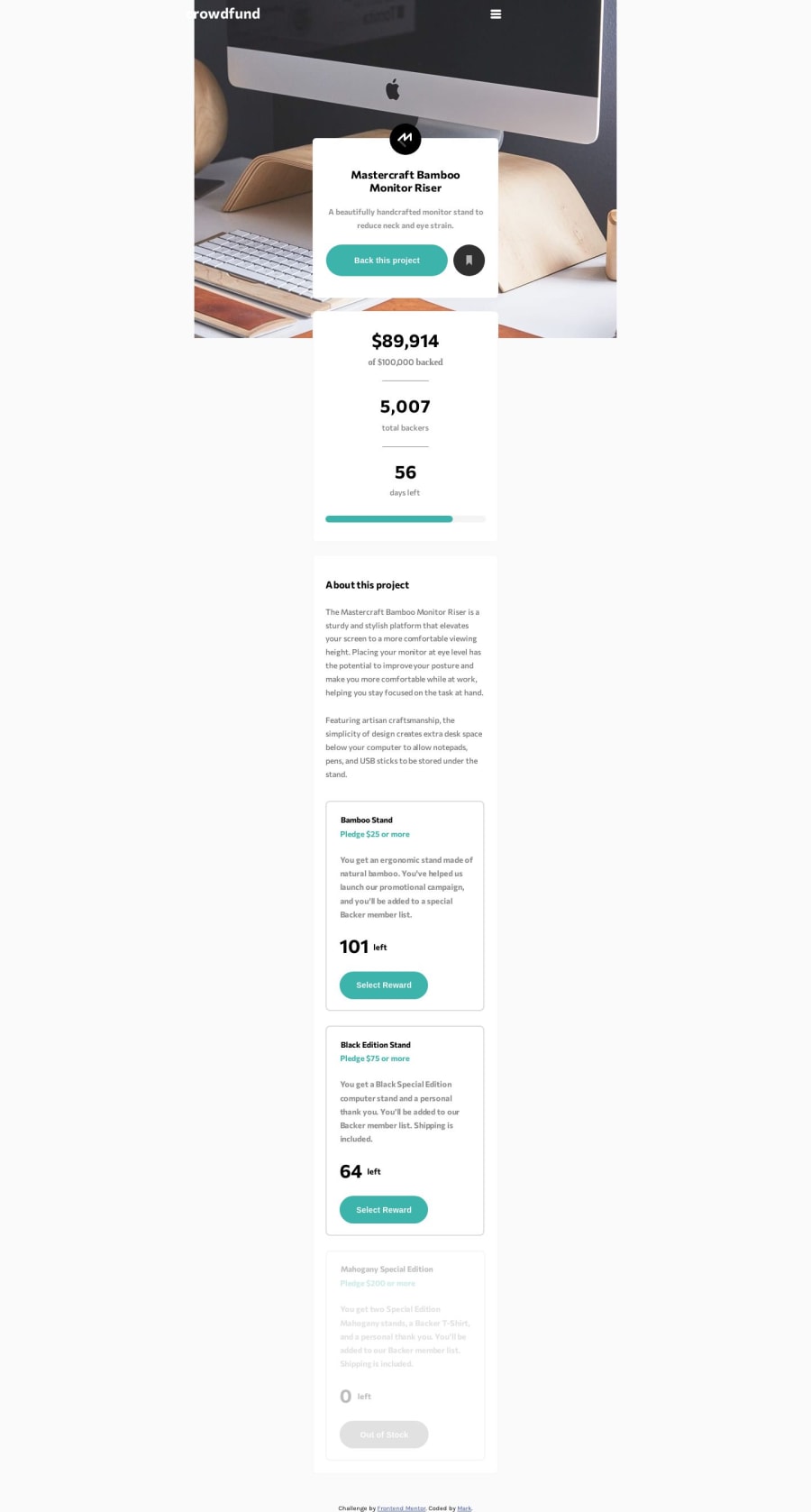
Mobile First Page: HTML, CSS(flexbox), Javascript, VSC, Brave browser
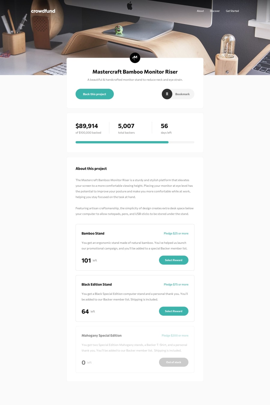
Design comparison
Solution retrospective
First of all, a big Thank You to Frontend mentor for providing this Challenge! Please feel free to dig into my code copy and share and provide the good, bad and ugly side, constructive criticism is always welcome. :)
Below Challenges and issues with some resolutions i found are..:
-
Hamburger Menu: I know i could have used the image but i wanted some cool animation effects going on, so i used a Pure CSS approach using 3 span elements.
-
Radio Buttons.: A: Styling them, I found challenging when styling them to put an outer border around them but managed to find a way round using the "outline" property in CSS, a solution provided from https://tinyurl.com/StyleRadioButtons3Ways . So all thanks to Joakim Lindberg for providing this.. 👍 and managed to show a nice animation when selecting the radio buttons. B: Using the "click "events from the EventListener gave a strange behaviour and got them working correctly using the ''change" events attaching the eventlistener to the radio button Id specifically, for example-: "radioBtn.addEventListener('change', showChanged);" where "showChanged" is a function i implemented that receives the events. This way i managed to get the radio buttons working ok.
-
Page tearing for the Mask occurred when scrolling when the Modal/Dialogue cards were displayed when testing on my sgs8+ mobile. Here removing 'height:100vh' and putting in the full length in px resolved it initially.
Last but not least i have also added some nice animation to the progress bar loading which was much easier that expected.
Thanks again and looking forward to your feedback. Best regards,
Community feedback
Please log in to post a comment
Log in with GitHubJoin our Discord community
Join thousands of Frontend Mentor community members taking the challenges, sharing resources, helping each other, and chatting about all things front-end!
Join our Discord
