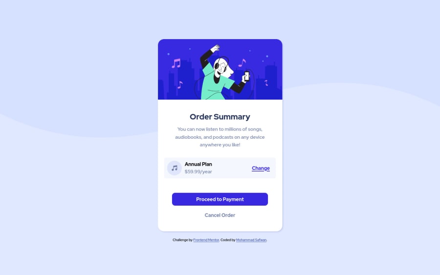
Design comparison
Solution retrospective
Hey, Frontend Mentor community!
I do not have access to Figma sketch to fit the exact size however I am open to any advice.
Community feedback
- @denieldenPosted over 2 years ago
Hi Mohammad, good job! I took some time to look at your code and have some ideas for improving it:
- remove
margin
from.container
class because with flex they are superfluous - instead of using
px
try to use relative units of measurement -> read here - the best way for add the top image in the background is just put more specific background properties to the body:
background: url("../img/pattern-background-desktop.svg") no-repeat top center; background-size: contain; background-color: #e0e8ff;
Overall you did well 😉
Hope this help and happy coding!
Marked as helpful1@safXcodePosted over 2 years ago@denielden Noted, Thank you for the suggestion..
1 - remove
- @Akhlak-Hossain-JimPosted over 2 years ago
Great work so far.
Don't worry about accessing the figma file, I don't have it too. Hope these will solve some of your coding error:
<h4> Annual Plan</h4>
try usingh1
as first heading.- instead of
<div class="container">
try using<main class="container">
- wrap
.attribution
code block withinfooter
tag - try not to keep
alt=""
empty inimg
tag
Happy coding :)
Marked as helpful1@safXcodePosted over 2 years ago@Akhlak-Hossain-Jim thank you for looking at my code. fixed everything except heading, from now on words i will use h1 as my first heading
0
Please log in to post a comment
Log in with GitHubJoin our Discord community
Join thousands of Frontend Mentor community members taking the challenges, sharing resources, helping each other, and chatting about all things front-end!
Join our Discord