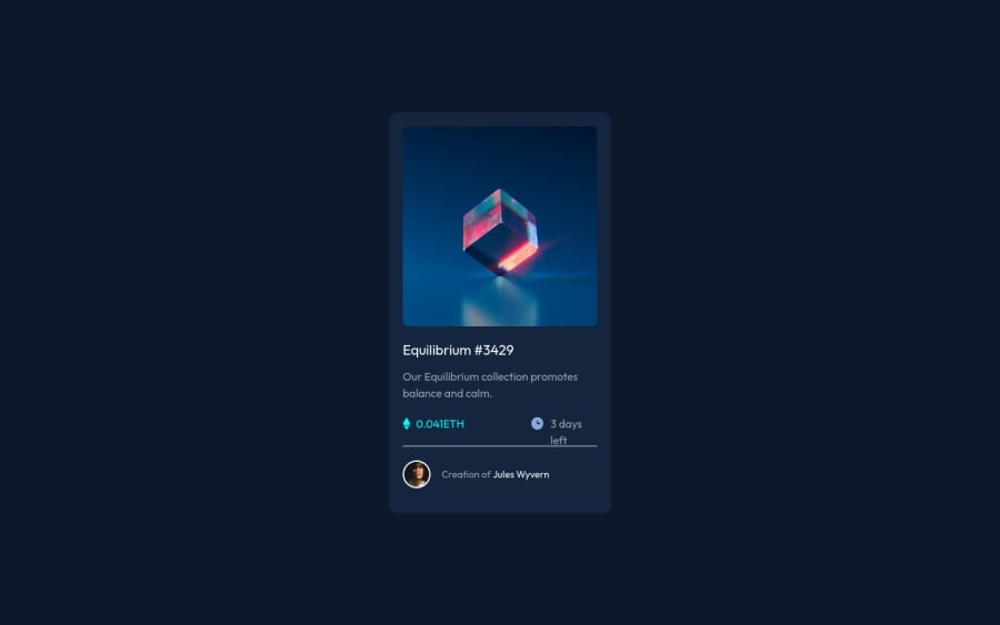
Mobile first NFT preview card using flex and Tailwind CSS
Design comparison
Solution retrospective
This is my first project built with Tailwind CSS. I am unsure about the installation of Tailwind. Can someone please provide me suggestions on which method is better for installing - Tailwind CLI or PostCSS? Thank you
Community feedback
- @grace-snowPosted almost 3 years ago
Hello
The html on this needs adjustment. Anywhere there is a hover style on the design it's saying "this is clickable". That means it is essential to use an interactive element for each one.
Once those anchor tags are in, don't forget to add obvious focus-visible styles as well to aid keyboard users π
Marked as helpful1@rk-codeflowPosted almost 3 years agoI was unaware about focus-visible @grace-snow. Need to dig about this. Huge thanks for pointing out this. ππ
0 - @MiculinoPosted almost 3 years ago
Congrats on completing the challenge, @rk-codeflow!
Your design looks nice and almost identical to the original one.
Try to make the gray line more subtle - either change the color or reduce its opacity.
Also, the transition effects should be triggered by hovers, not clicks.
Marked as helpful1@rk-codeflowPosted almost 3 years agoTons of thanks for your kind words @Remus432. "Also, the transition effects should be triggered by hovers, not clicks" - I had never thought about this. Really thanks for your time.
0 - @rsrclabPosted almost 3 years ago
Hi, @rk-codeflow ~
Congratulate on great work here ~ I have studied your work, and really loved the way you used TW classes for card. Nice trying! Here are some of my tips on this project.
- Trying transition effects on hover event will make things more beautiful, I am sure.
- I think using pure CSS would be better on this case as it is rather simple project. Using TW on this will lead to countless HTML validation errors like now.
- While using pure CSS, please try BEM structuring, it will help you a lot.
Here is my solution to this challenge and if it can help you even a bit, it would be really happy to me.
https://www.frontendmentor.io/solutions/my-first-solution-on-chanllenge-V-4IzAivH
Cheers ~
Marked as helpful1@rk-codeflowPosted almost 3 years ago@tymren608 These are some awesome suggestions. Thanks a lot. Next time I will definitely keep these things in mind. I saw your code too. It is pretty well-structured. I would suggest you using clamp function for responsive text. This way, you don't have to define your font-size in media query.
0 - @anoshaahmedPosted almost 3 years ago
Hey Keeran, to get rid of the accessibility issue shown in your Report, have at least one
<h1>
in your code :)Marked as helpful1
Please log in to post a comment
Log in with GitHubJoin our Discord community
Join thousands of Frontend Mentor community members taking the challenges, sharing resources, helping each other, and chatting about all things front-end!
Join our Discord