Not Found
Not Found
Not Found
Not Found
Not Found
Not Found
Not Found
Not Found
Not Found
Not Found
Not Found
Not Found
Not Found
Not Found
Not Found
Not Found
Not Found
Not Found
Not Found
Not Found

Submitted

Mobile First | NFT Card

Zero 50

@ZeroBl21

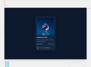
Desktop design screenshot for the NFT preview card component coding challenge

This is a solution for...

  • HTML
  • CSS
1newbie
View challenge

Design comparison


SolutionDesign

Solution retrospective


Do I have too many divs? I'm open to any feedback you want to give, as long as it is not destructive.

I have to say that I quite like this design, quite minimalist, but quite good looking

Community feedback

P
Fluffy Kas 7,715

@FluffyKas

Posted

Hey there, I think it's a great looking solution! Regarding the divs, you seem to have 2 of them that aren't very necessary: the "wrapper" (all its styles could be just applied on the body, thought I'd change the height to min-height) and the "main-title" (I don't see a reason why the title and the p needs to be wrapped, as you're not using them for positioning or styling its children).

Apart from this there are a few things worth mentioning.

  1. You're using a h2 for your title, which is the only heading in this challenge. You should either use an h1 here or if you're thinking of this component as a part of a bigger design, you could place a screen-reader only h1 at the top: that would still function as a landmark but wouldn't be visible to the average user. If you google sr-only classes, you could find some great examples on how this might work!

  2. For the alt text of the creator, "Jules Wyvern" would be a better choice (your aim here is to be descriptive, and "Avatar" doesn't tell much to people who don't see the image ^^).

  3. You're missing the hover from the Equilibrium image!

  4. I know we were just talking about having too many divs but if you change your html (main-info section) slightly and wrap the p tag and the tiny ethereum/clock image (or their spans) in a div, you could apply display: flex and align-items: center on them, so they'd be better aligned ^^

  5. Adding custom focus indicators would be great! MDN has a very helpful article about this, since I've read it, I try to pay attention to this in all my projects. In my solution to this challenge for example, I added focus indicators that match the cyan colour you use for hover states. They're a lot more visible than the default focus and they look quite fun :)

Apart from these, your solution is almost pixel-perfect and your box-shadow is really lovely! Well done!

Marked as helpful

1

Zero 50

@ZeroBl21

Posted

@FluffyKas Greetings, I had the wrapper as a test at the beginning and it stayed until the end, this is because, although it is a single page, I worked on it so that it can be easily integrated into a complete page, but it is true, here that is not necessary, so I removed it. About Main-title is personal taste more than anything, I like to be specific about these things.

1- You are totally right, bad habit.

2- Fixed, that was another placeholder, which remained in the final product.

3- Done, I am not going to lie, I did not expect feedback so fast, I was thinking of doing it today.

4- Position: Relative; top: 3px; right: 2; no more divs needed!

5- I'll keep an eye on it later, I need to learn more about UX/UI design.

I thought that few would appreciate the box shadow, quite happy that you like it, the Feedback is appreciated.

ps: sorry if there are errors in writing, English is not my native language

0

Please log in to post a comment

Log in with GitHub
Discord logo

Join our Discord community

Join thousands of Frontend Mentor community members taking the challenges, sharing resources, helping each other, and chatting about all things front-end!

Join our Discord