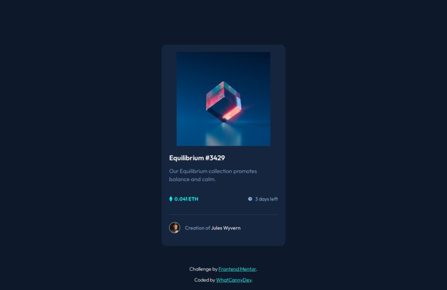
Design comparison
SolutionDesign
Solution retrospective
What are you most proud of, and what would you do differently next time?
Just proud to keep going. It was an easy challenge, considering the ones I've already achieved.
What challenges did you encounter, and how did you overcome them?Nothing in particular
What specific areas of your project would you like help with?I'm always open to criticism, which helps me to improve.
Community feedback
- P@makogeborisPosted 7 months ago
Great work @CannyRo here are some suggestions
- Avoid setting fixed
heightsandwidthson elements, as this can create problems with responsiveness and content fit. Instead, let the content and padding determine the element’s size. If necessary, usemax-widthormin-height. Currently, the .card isn't responsive on small screen sizes, change thewidthof the .content tomax-width. Also remove theheightcompletely from the .card__header - The
position: absoluteyou set on thefooteris causing an overlap with the card, remove it. Also, there is a typo with thefont-size: 0,875px;declaration you put a,instead of a. - Remove the
.card-imgdeclaration in the media query declaration because it is causing the image not to take it's full width and doesn't align with the overlay when hovered. - Every page should have at least one heading element typically an
h1element to provide a clear structure. The .card__title should be a Heading Element - It's best practice linking Google fonts directly in the HTML
headsection rather than directly in your CSS file as it enables asynchronous downloading, improving page load times. - Consider using a modern CSS reset at the start of the styles in every project. Like this one Modern CSS Reset. This will help reset a list of default browser styles.
1 - Avoid setting fixed
Please log in to post a comment
Log in with GitHubJoin our Discord community
Join thousands of Frontend Mentor community members taking the challenges, sharing resources, helping each other, and chatting about all things front-end!
Join our Discord
