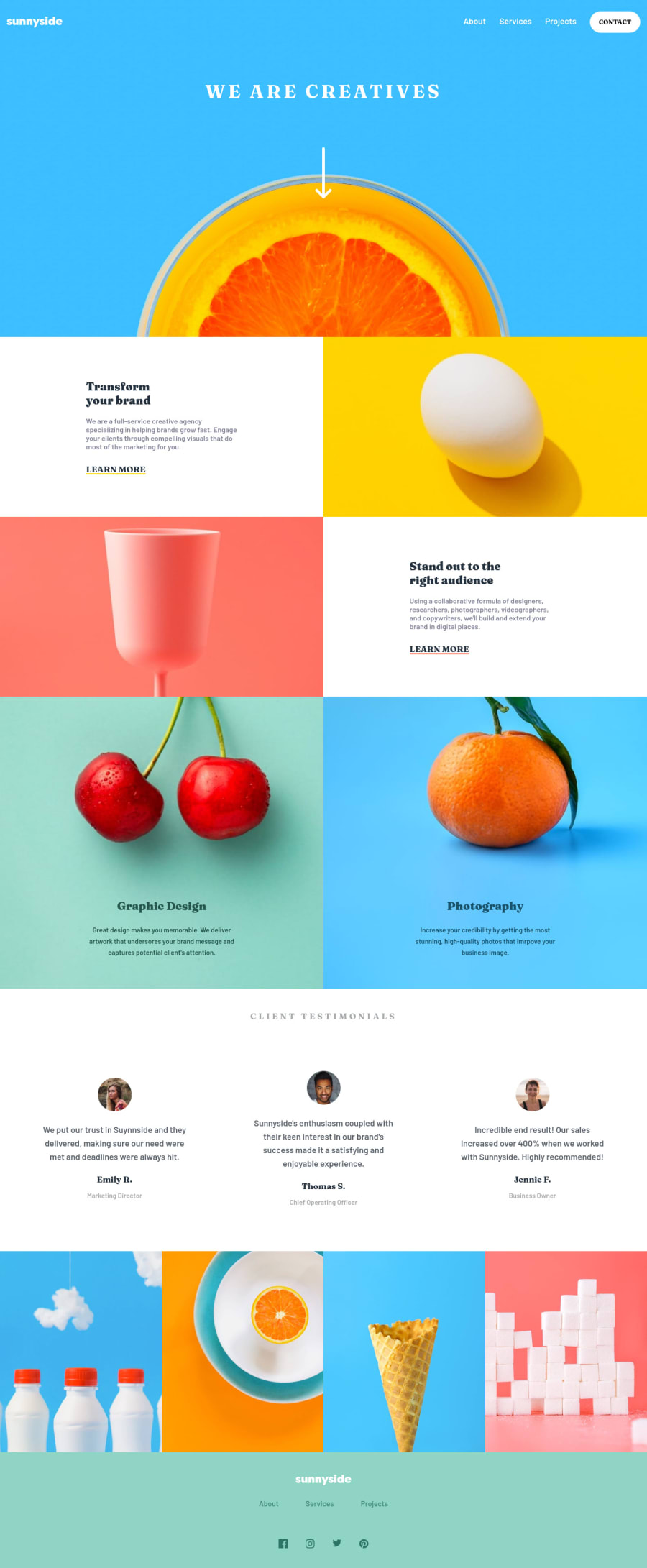
Design comparison
Solution retrospective
I had some problems with the header image and two images (egg and glass) with their sizes since they would just grow bigger and zoom in and couldn't really figure out how to solve it. If anyone has any idea please share.
Any other feedback is also welcome :)
Community feedback
- @gerichilliPosted over 2 years ago
About the header, I think it's because you set background-size: 100%; the width of the image will be equal to the screen width and its height will shrink to keep the aspect ratio, try setting with background-size: cover; so that it can fill the header space. Hope it helps you.
1@dtomicicPosted over 2 years ago@gerichilli setting the
background-size:coverwas my first solution but that doesen't help, I've thought of an idea to cut out the main part out of the picture and just set the background to the color of the background so I'll try that. But thanks for your feedback anyways.0
Please log in to post a comment
Log in with GitHubJoin our Discord community
Join thousands of Frontend Mentor community members taking the challenges, sharing resources, helping each other, and chatting about all things front-end!
Join our Discord
