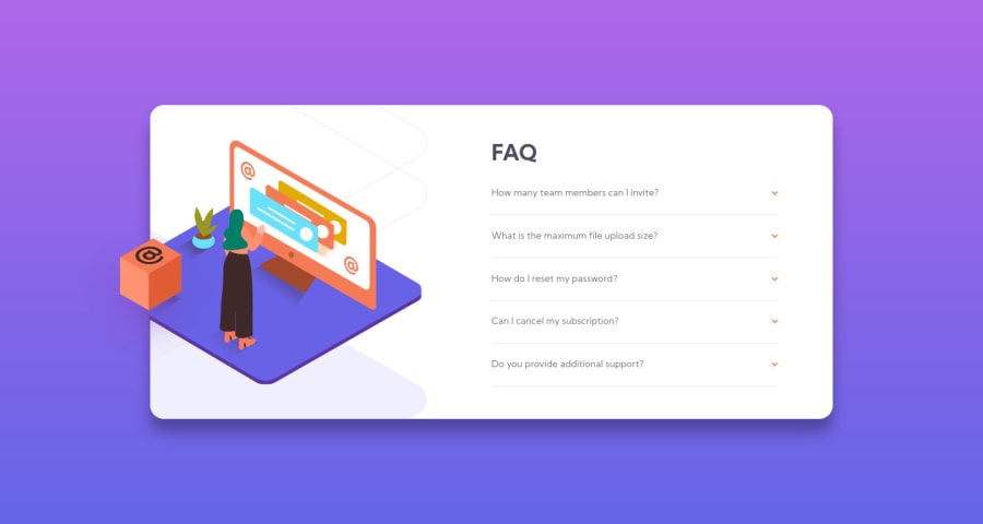
Mobile first layout using HTML, CSS and JavaScript
Design comparison
Solution retrospective
Hey guys,
This is my second submission. Made a few suggested changes in the css and am happy with the layout for the most part. Still would like to improve the functionality. I want to be able to close the accordion when clicking on the question that's already open. As of now, you can open the accordion when clicking on a question and it closes when you click on and open another, but I would like to be able to click the open one again to close it. Any suggestions? Thanks!
Community feedback
- @SJ-NosratPosted over 3 years ago
Hi Nick, Great solution! With regards to your first point, see the below steps, as follows:
-
Remove the
overflow: hidden;on<div class="split image-container">in your CSS. -
Add
position: relative;to your.desktop-imagesclass in your CSS. -
Use the
topandleftproperties to position your box image to the desired position. The properties accepts negatives values too. -
Lastly to clip the part of the hero image, add the following;
   .main-image {
    display: block;
    position: absolute;
    transform: translate(-20%, -50%);
    z-index: 2;

    /* ADD THE BELOW CODE */
    clip-path: inset(0 0 0 4.5rem);
  }
The
insetvalue takes values starting with the top - right - bottom - left much like the shorthand for properties likemargin. Think ofclip-pathas taking a cutter and cutting rectangular strips of a specified length.- For
<img class="arrow" src="/images/icon-arrow-down.svg" alt="" />if thealt=""is left empty, then add thearia-hidden="true"attribute, as this allows screen-readers to skip<img>tags that are purely used for decorative purposes. Also, some of your<img>tags are missing thealtattribute; that's you're getting HTML issues. Also, look into semantic HTML.
With respect to your second point, you can add the following;
 body {
  height: 100vh;
  background-image: linear-gradient(var(--soft-violet), var(--soft-blue));
  font-family: "Kumbh Sans";
  font-weight: 400;
  font-size: 0.85rem;
  line-height: 1.6;
  color: var(--dark-grayish-blue);
  position: relative;

  /* ADD THE BELOW CODE*/
  display: grid;
  align-content: center;
}
That should get rid of the excess scroll bar.
Hope the above helps!
Best of luck with your coding jouney!
Marked as helpful1@nickcarlisiPosted over 3 years ago@shahin1987 I implemented all the changes you recommended and they all worked great. I had no idea about clip-path. Very cool! Thanks again!
0@SJ-NosratPosted over 3 years ago@nickcarlisi Cool! Happy to hear I could help! Best of luck!
0 -
- @nickcarlisiPosted over 3 years ago
Awesome! Can't wait to implement these changes tomorrow and see how it turns out! Thanks so much for the thorough tips and recommendations!
1 - P@MiculinoPosted over 3 years ago
Good job, Nick!
Your design looks good on different device sizes and it's almost pixel-perfect. The box-shadow might need some slight adjustments. Also, I think it'd be nice to be able to close an accordion by clicking on it again, not having to click and open another accordion. Overall, well done!
0@nickcarlisiPosted over 3 years ago@Remus432 Thanks! Yes, I agree on being able to close the accordion by clicking again, but I'm struggling to get it working. Any advice? Thanks again!
0
Please log in to post a comment
Log in with GitHubJoin our Discord community
Join thousands of Frontend Mentor community members taking the challenges, sharing resources, helping each other, and chatting about all things front-end!
Join our Discord
