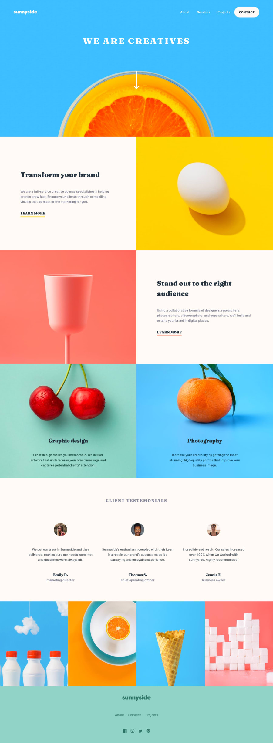
Design comparison
Solution retrospective
- Is it okay to set static font size like 18px and then use
ems to set font sizes? Or is it better to use 1remonbodyand scale other elements appropriately? - Should I use SASS to better manage my CSS...? Or is it okay for these early stages?
- I used
sectionelement on 4 image gallery at the bottom of the page without the heading, Is it okay? There was no heading in the design and the gallery felt it was a separate section of the site. Should I usediv?
Edit: Changed section to div.
I tried to use semantic HTML, organized CSS as much as possible (although it was still hard to manage).
Had some issues with mobile menu popping up when resizing back to the mobile layout.
The styles I set via Javascript using style.display are directly put in HTML as inline styles, so they were prioritized over media queries and that caused some weirdness.
I fixed it by removing style attribute in HTML so that my media queries could take over.
Edit: realized I could have toggled .visible and .hidden classes when clicking the menu icon.
window.addEventListener('resize', _ => {
  if (window.innerWidth >= 768) {
    menu.removeAttribute('style')
  }
})
I would appreciate if you could provide any type of feedback. Maybe there's some visual bugs on the site, or I didn't use the best practice somewhere.
Please log in to post a comment
Log in with GitHubCommunity feedback
No feedback yet. Be the first to give feedback on eagermonument81's solution.
Join our Discord community
Join thousands of Frontend Mentor community members taking the challenges, sharing resources, helping each other, and chatting about all things front-end!
Join our Discord
