
Submitted about 4 years ago
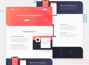
Mobile first landing page using flexbox and scss

@MonikaCyprys
Design comparison
SolutionDesign

Solution retrospective
Hey guys! :D
I will appreciate if you can check this site for readability. i just tried to make good readable for small and big screens. any other feedback also would be great!
Have a nice day! :)
Please log in to post a comment
Log in with GitHubCommunity feedback
No feedback yet. Be the first to give feedback on Monika Cyprys's solution.
Join our Discord community
Join thousands of Frontend Mentor community members taking the challenges, sharing resources, helping each other, and chatting about all things front-end!
Join our Discord