Submitted over 3 years ago
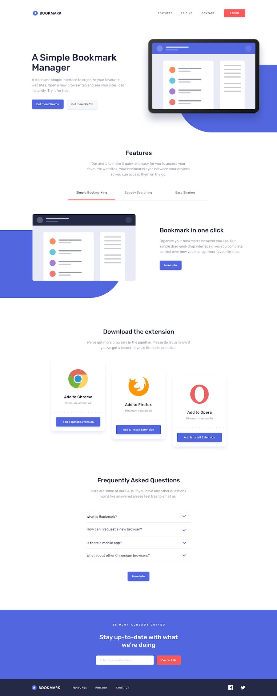
Mobile First Landing Page (HTML, SCSS, JS, Gulp, Grid, FlexBox)
@shaj-ed
Design comparison
SolutionDesign
Solution retrospective
Give your honest feedback !
Community feedback
- @vermilion4Posted over 3 years ago
This is honestly pretty nice but at medium screen mode, under the download extension part...the positioning and spacing looks off since the opera is below and the other two are not lined; visually anyways. Other than that, it is beautifully done.
0@shaj-edPosted over 3 years ago@vermilion4 i use flex wrap on that section this is what do flexwrap. Thanks anyway
0
Please log in to post a comment
Log in with GitHubJoin our Discord community
Join thousands of Frontend Mentor community members taking the challenges, sharing resources, helping each other, and chatting about all things front-end!
Join our Discord
